

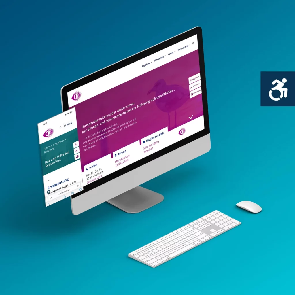
Designing a new website for the Blind and Visually Impaired Association of Schleswig-Holstein meant one thing: the people best placed to judge whether it works never see the screen. That is exactly what made this one of the most instructive projects I have ever been part of.
The site went live in 2024. In 2026 I went through all of it again and brought it up to today's standard, WCAG 2.1 level AA. This case study tells both stories, the relaunch and the fine-tuning, because accessibility is rarely finished at launch.
Where things stood
The association's old site had aged, in looks as much as under the hood. It needed a fresh start, one that not only felt more current but was genuinely usable for the very people it is meant for. And those people set the highest bar you can possibly set for accessibility: people who are blind or have low vision and experience their website every day through a screen reader and keyboard.
It's not only about tech and design
The really exciting part of this project wasn't in the code at all, it was in the working together. How do you show a design to someone who can't see it? How do you run a video meeting where one side only hears the layout and the other sees it? How do you describe design in words that genuinely land? We found our own ways through all of it, with a lot of patience, clear descriptions and the willingness to say honestly what works and what doesn't (yet).
The real job
Under the surface there was real detail work. I reworked the navigation and search so that screen readers read them out reliably and move through them in a sensible order. An Apple update that caused trouble along the way, we caught and dealt with. And behind the scenes there are small but effective helpers at work, like the option to duplicate page templates without dragging the entire navigation along every time, plus a menu you can always reach. On the coding side, Anne K. Frey was right there alongside me.
Two years on: the WCAG 2.1 AA review
A website keeps living after it goes online. Content is added, posts are maintained by several people, blocks are copied and adapted. That is exactly where the small blemishes creep in – the ones you never notice by looking and that stand out immediately when the page is read aloud. In September 2026 I therefore checked the site in full rather than by sampling: 29 pages, 64 posts, every reusable block and the footer.
I checked heading structure, link texts, alternative texts, colour contrast, form labels, keyboard operation, landmark regions and the behaviour with increased line and character spacing. What turned up was less one big fault than a pile of small points of friction.
What has changed since
- The home page now runs at a readable width. Technically it was still sitting in half a grid column, a leftover from when the content ran in two columns. Line height is now 1.6 instead of 1.32, and images are no longer wrapped by narrow columns of text.
- Links in body text are underlined. Before, colour alone set them apart, at a contrast of 2.15 to 1 against the surrounding text. The requirement is at least 3 to 1.
- Heading levels run without gaps across all 93 pages and posts, and every page has exactly one main heading.
- Around a hundred empty headings have disappeared from the read-aloud structure. They were being used as spacers; screen readers announced them and then read nothing.
- 52 links now announce that they open a new window, and nine ambiguous link texts name their destination. Both invisible, both only for screen readers.
- The keyboard focus is visible with a strong outline, including on the dark areas in the header and footer.
- The buttons for enlarging and reducing the text no longer cover any content.
- Footer and breadcrumbs are marked as their own regions, so a screen reader can jump straight to them.
- In the mobile menu, submenus can be opened by keyboard again, and while the menu is open the background is hidden from assistive technology.
- The table of contents of the statutes no longer consists of 21 sixth-level headings that clogged up heading navigation.
Checked and found sound: every text colour contrast at level AA, the alternative texts of all images, the labelling of the form fields, the skip link to the content, and the behaviour at 320 pixels window width, where nothing scrolls horizontally.
Why real-world testing makes the difference
Automated testing tools find the measurable faults. What they cannot find is whether a page sounds right. At BSVSH both come together, and the second part comes from the association itself. Throughout, I checked and counter-tested with Dr Jürgen Trinkus, who uses the site with his own assistive technology. No larger change went through until it had proved itself in practice.
The finest example is the home page. It was originally built in two columns, which worked well visually. Read aloud, however, that arrangement threw the members off, because the order in the ear is not the order in the eye. No testing tool would have delivered that feedback. Since then the home page runs in one column, and in 2026 I cleared away the technical remains of that change as well.
What is still open
Two points remain open. The monthly audio magazine MoinSeHn is pure audio, and WCAG asks for a text version of it as early as level A. And the PDF documents in the download area have not yet been checked against PDF/UA. Both are editorial work, both have been raised with the association. For the members, these two points matter more in everyday use than anything I did in the source code.
The takeaway
What came out of it is a website that shuts no one out, and one that was tested by exactly the people best placed to do it. Accessibility here wasn't a box to tick at the end, it was the whole point. It's live:
Visit the live site → bsvsh.org
And it stays a task. The 2026 review showed that even a well-built site gathers blemishes again in everyday use as soon as several people maintain the content. Anyone who takes accessibility seriously therefore schedules a regular review, the way security updates are scheduled. At BSVSH that is now part of the support.
This is how I work for other clients too: accessible web design, thought through from the first sketch instead of bolted on at the end.
Frequently asked questions about accessible websites
Do automated testing tools make a website accessible?
No. Tools reliably find the measurable faults: missing alternative texts, weak contrast, unlabelled form fields. What they cannot hear is whether a page reads well aloud. At BSVSH that insight came from the association itself: the home page was built in two columns and looked good, but read aloud it threw everyone off, because the order in the ear is not the order in the eye. No tool would have reported that.
How often does an accessible website need to be checked?
Regularly, the way security updates are scheduled. A website keeps living: content is added, several people maintain posts, blocks are copied and adapted. That is exactly where the small blemishes creep in – the ones nobody notices by looking and that stand out immediately when the page is read aloud. At BSVSH two years lay between the relaunch and the full review, and quite a bit had accumulated. Once a year is a good rhythm.
What is examined in a WCAG 2.1 AA review?
At BSVSH it was: heading structure, link texts, alternative texts, colour contrast, form labels, keyboard operation, landmark regions and the behaviour with increased line and character spacing. Plus whether anything scrolls horizontally at 320 pixels window width. Nothing was sampled; everything was checked: 29 pages, 64 posts, all reusable blocks and the footer.
Is colour enough to mark links in body text?
No. Anyone who has trouble distinguishing colours will miss the link. WCAG therefore asks for a contrast of at least 3 to 1 against the surrounding text – or a second distinguishing feature. At BSVSH the colour contrast was 2.15 to 1, so colour was doing the job alone. Since the review the links are underlined, which is the simplest and most reliable answer.
Does a website have to be rebuilt to become accessible?
Not necessarily. If the foundations are sound – clean code, a sensible structure, a system you can maintain – a great deal can be sharpened up. That was the case at BSVSH: the 2024 site was well built, and the 2026 review mainly removed friction that everyday use had introduced. A rebuild pays off when the existing system itself is the obstacle.
What about PDF files and audio content?
They count too. For audio-only content, WCAG asks for a text version as early as level A, and PDF documents should be produced and checked against PDF/UA. At BSVSH those are exactly the two open points: the monthly audio magazine and the files in the download area. Both are editorial work, and for the members they matter more in everyday use than a lot of what sits in the source code.