

Toto & Flo

About Me
Jenny Wullich

Ein Logo mit französischem Touch für handgenähte Babydecken, das nicht nur als Marke, sondern auch als Fähnchen am Produkt funktioniert.
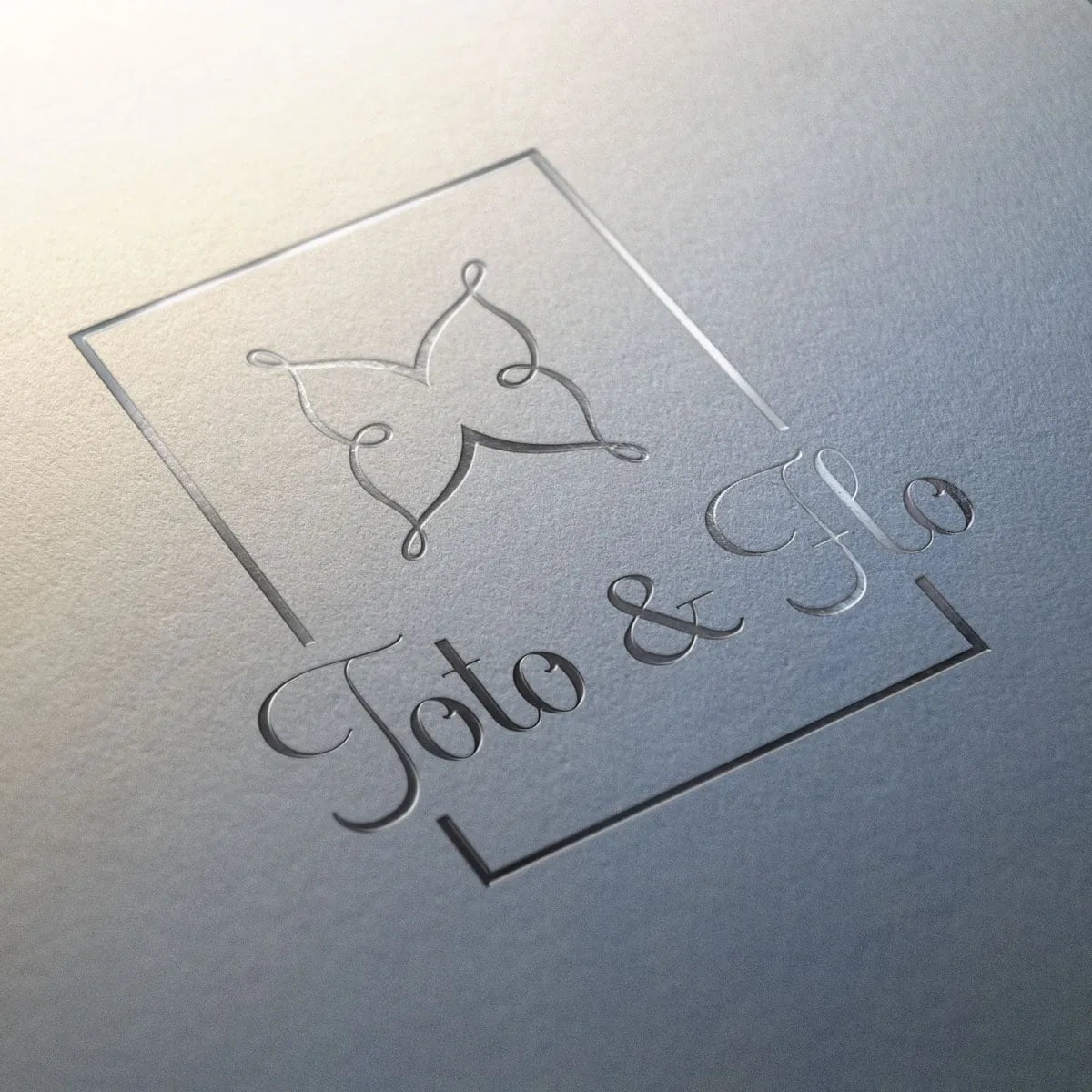
A logo with a French touch for hand-sewn baby blankets - one that works not only as a brand, but also as a little tag on the product itself.

Kunde Toto & Flo, Label für handgenähte Babydecken Client Toto & Flo, a label for hand-sewn baby blankets Leistung Logoentwicklung, Icon & Wortmarke Service Logo development, icon & wordmark
Logo für Toto & Flo, Icon und Wortmarke.
Logo for Toto & Flo, icon and wordmark.

Die Aufgabe

The Brief

Toto & Flo steht für hochwertige, handgenähte Babydecken mit französischem Touch. Das Logo sollte exklusiv wirken und zugleich eine Doppelfunktion erfüllen: als Marke nach außen und als kleines „Annäher"-Fähnchen direkt am Produkt. Was am Etikett einer edlen Decke funktioniert, muss auch auf Website und Visitenkarte bestehen, und umgekehrt.

Toto & Flo stands for high-quality, hand-sewn baby blankets with a French touch. The logo needed to feel exclusive while pulling double duty: an outward-facing brand and a small "sew-on" tag right on the product. Whatever works on the label of a fine blanket also has to hold up on the website and business card - and the other way around.

Der Weg

The Approach

Damit beides zusammengeht, habe ich das Zeichen in mehreren Varianten entwickelt: mit und ohne Schriftzug, in unterschiedlichen Größenlogiken. So trägt das Icon allein genauso wie die volle Wortmarke, je nachdem, wie viel Platz und wie viel Ton ein Anwendungsfall verlangt. Der französische Einschlag steckt dabei weniger im Klischee als in Feinheiten: Proportion, Leichtigkeit, ein Hauch Zurückhaltung.

To make both work, I developed the mark in several variants: with and without lettering, following different sizing logics. That way the icon carries on its own just as well as the full wordmark, depending on how much space - and how much presence - a given use calls for. The French note lives less in cliché than in the small things: proportion, lightness, a hint of restraint.

Ein Logo mit zwei Leben

A Logo with Two Lives

Die spannendste Anforderung war die Doppelrolle: Ein und dasselbe Zeichen sollte digital als Marke auftreten und physisch als Applikation am Produkt. Genau dafür lohnt sich ein Logoset aus Icon und Wortmarke, das flexibel bleibt, statt einer einzigen, starren Fassung.

The most exciting requirement was the dual role: one and the same mark had to show up digitally as a brand and physically as an appliqué on the product. This is exactly where a logo set of icon and wordmark pays off - one that stays flexible instead of a single, rigid version.

Das Ergebnis

The Result

Entstanden ist ein durchdachtes Premium-Branding mit praktischem Mehrwert: ein Symbol, das eigenständig und integriert funktioniert und sich als Fähnchen direkt an die Decke annähen lässt. So wird aus dem Logo nicht nur ein Erkennungszeichen, sondern ein Teil des Produkts selbst.

The outcome is a thoughtful premium brand with real practical value: a symbol that works both on its own and integrated, and that can be sewn straight onto the blanket as a little tag. That turns the logo into more than a mark of recognition - it becomes a part of the product itself.

← Zurück zu Projekte
Jenny Wullich

Hast du ein ähnliches Projekt? Dann erzähl mir davon.

Am liebsten ganz unkompliziert in einem Video-Call. Hier schauen wir in Ruhe, ob wir zueinander passen.