


A logo with a French touch for hand-sewn baby blankets - one that works not only as a brand, but also as a little tag on the product itself.
The Brief
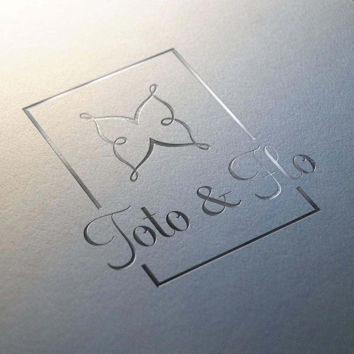
Toto & Flo stands for high-quality, hand-sewn baby blankets with a French touch. The logo needed to feel exclusive while pulling double duty: an outward-facing brand and a small "sew-on" tag right on the product. Whatever works on the label of a fine blanket also has to hold up on the website and business card - and the other way around.
The Approach
To make both work, I developed the mark in several variants: with and without lettering, following different sizing logics. That way the icon carries on its own just as well as the full wordmark, depending on how much space - and how much presence - a given use calls for. The French note lives less in cliché than in the small things: proportion, lightness, a hint of restraint.
A Logo with Two Lives
The most exciting requirement was the dual role: one and the same mark had to show up digitally as a brand and physically as an appliqué on the product. This is exactly where a logo set of icon and wordmark pays off - one that stays flexible instead of a single, rigid version.
The Result
The outcome is a thoughtful premium brand with real practical value: a symbol that works both on its own and integrated, and that can be sewn straight onto the blanket as a little tag. That turns the logo into more than a mark of recognition - it becomes a part of the product itself.