

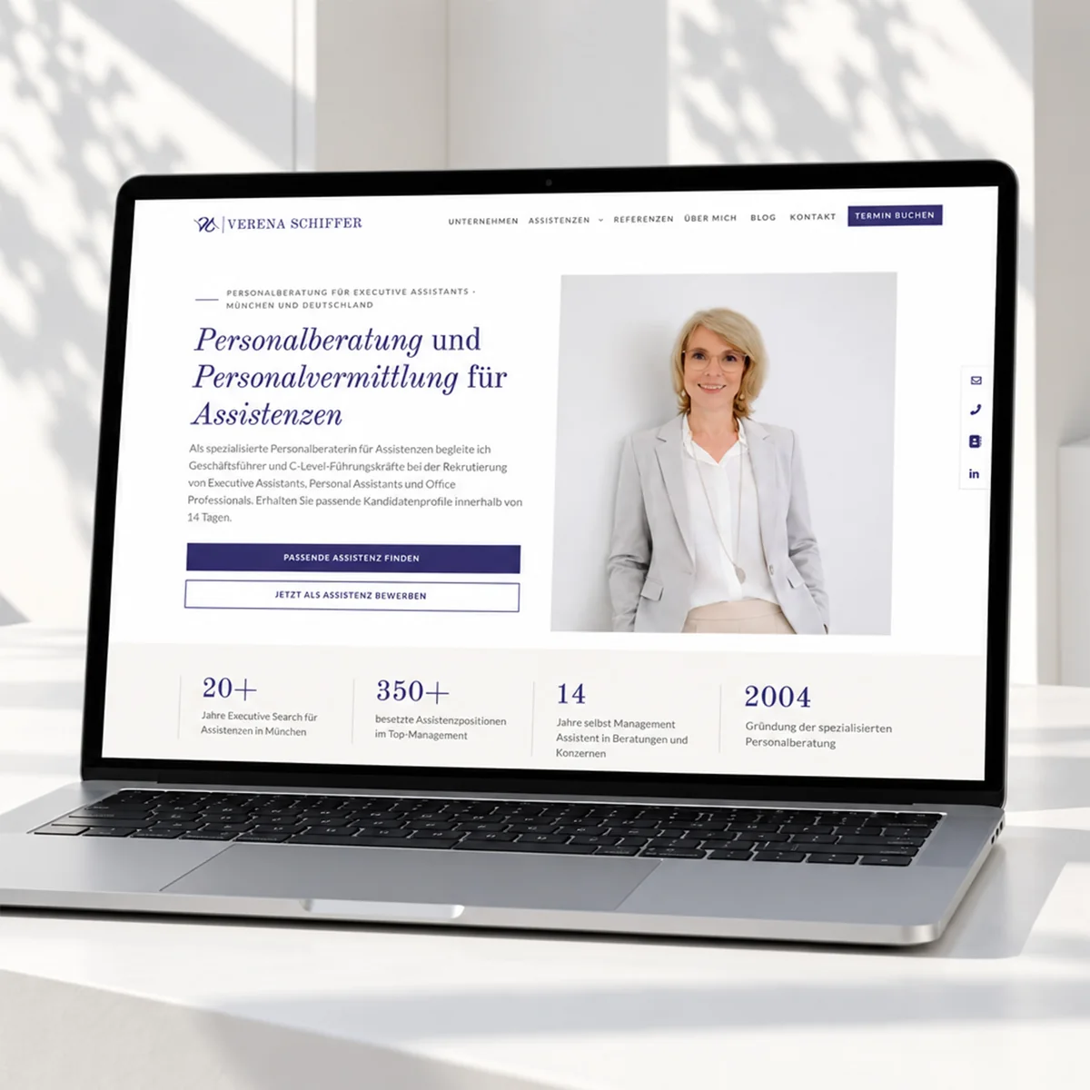
Verena Schiffer runs a recruitment consultancy for assistants and office professionals in Munich. Her website was well positioned in terms of content and search engines, but its effect fell short of what Verena Schiffer delivers in the market. She recognised that early and deliberately chose a redesign over further piecemeal corrections. I rebuilt the site visually, deliberately left the existing SEO structure untouched and reworked the logo in parallel. The result is a relaunch that raises the perceived value of the brand, removes two technical legacies in the page structure and does not endanger the site's rankings. The effect on enquiries and conversion is now being observed over the coming months.
Starting point
Verena Schiffer has been placing assistants in top management since 2004, filling more than 350 positions in that time. Her clients include managing directors and C-level executives, as well as assistants looking for their next career step. In this market segment the first impression plays a part: whoever wants to build trust in personnel matters has to appear serious and high-quality themselves.
Verena Schiffer had developed the existing website consistently over the years. It was rich in content, and a great deal of careful work had gone into search engine optimisation, with measurable success. What no longer fitted was the effect: the site came across more modestly than Verena Schiffer's position in the market justifies.
Seeing that yourself and taking the step towards a redesign instead of continuing to polish individual spots is a decision many entrepreneurs put off for a long time. Verena Schiffer made it clearly and backed it with a precise brief: more quality, more calm, the existing visibility untouched.
What I found
The site was technically solid. But two constructions from earlier rebuilds made maintenance unnecessarily laborious, and that was no omission on the client's part but a consequence of structures grown over time.
Two H1 headings per page
The header area was built separately for desktop and for mobile devices, both variants were in the source code at the same time and were shown or hidden depending on screen width. For a page to show a main heading on both devices, it needed two H1 elements. For search engines that is a blurred signal, for screen readers a double announcement.
Blog posts by hand
The blog preview on the home page was hard-coded. When Verena Schiffer published a new post, it did not appear there automatically but had to be added manually. An effort that recurs with every post and tends to get left behind in day-to-day business.
Then there was the imagery. Verena Schiffer has exceptionally good photos, they were just cropped and used inconsistently, so their potential did not come across.
Approach and division of roles
I first developed a design basis: typography, colour system, spacing grid, image formats and the structure of the sections. This basis was played through on the home page and transferred from there to the other pages. That creates a structure that repeats instead of being reinvented on every page.
Jenny Wullich is responsible for concept, web design, imagery and the logo redesign. Ramona Kuchenbaur looks after search engine optimisation and checked the drafts for content before they went live. Verena Schiffer contributed content and made decisions, and looked at every interim stage.
Work was not done on the live website but on separate draft pages within the same WordPress. Home page and company page were created as separate drafts that were only visible internally. The live site kept running unchanged until Verena Schiffer gave her approval. Only then was the content swapped in one step, secured by a complete backup of files and database.
Why the SEO structure stayed untouched
The most important decision in the project was a non-decision: we did not set up the existing search engine optimisation anew. URLs and page structure stayed, as did the content focus of the individual pages. What changed was the presentation.
That is the point at which many relaunches lose visibility. If the look is renewed and the keyword set re-sorted at the same time, it is impossible to say afterwards which change had which effect. If visibility drops, you are searching in the fog. Because the content and structural side remained stable, the design is the only variable worth mentioning. If the numbers change now, the cause can be attributed.
The two technical corrections, a single H1 and the automatically filled blog preview, additionally improve the signals without intervening in the content focus.
Typography: deliberately serif, deliberately refined
For the type the decision fell on a serif typeface in the headings, combined with a calm sans serif in the body text. That carries the look Verena Schiffer was after: a presence that works with permanence and quality rather than with pace and volume.
This choice is a design decision in favour of the brand effect. Developing the site according to the criteria of accessible web design was expressly not a goal in this project, and for good reason: Verena Schiffer's clients decide strongly on look and feel, and a presence optimised for accessibility follows different rules in type choice and contrast values, as well as in the use of images. Wanting both at once leads to a compromise that serves no one. Basics that belong to a clean site anyway are nevertheless implemented: a single main heading per page, a logical heading hierarchy, labelled controls and alternative text for images.
Imagery
The photos were brought to uniform formats and aligned so that the focal point sits right. An example from the project: the featured image of a blog article showed Verena Schiffer in landscape format, it was displayed in portrait format. The crop defaulted to the centre, which put her off-axis. Instead of re-cropping the photo and thus changing the file, we defined the image position for exactly this motif. The image stays unchanged in the media library, the display sits right.
Such small things do not stand out individually. Taken together they decide whether a site feels calm and coherent.
Maintainability: job ads that Verena Schiffer controls herself
Verena Schiffer publishes her job ads herself, several times a month. That is why the job board was rebuilt so that it works without outside help: tasks, profile and benefits are real lists that continue with the Enter key. Industry, location and scope are entered once in the header of the ad and appear automatically in the overview. Sorting follows the publication date. What used to trigger queries, she now does in a few minutes.
The course, including the tough spots
The path was not straight at every step, and that is part of an honest project report.
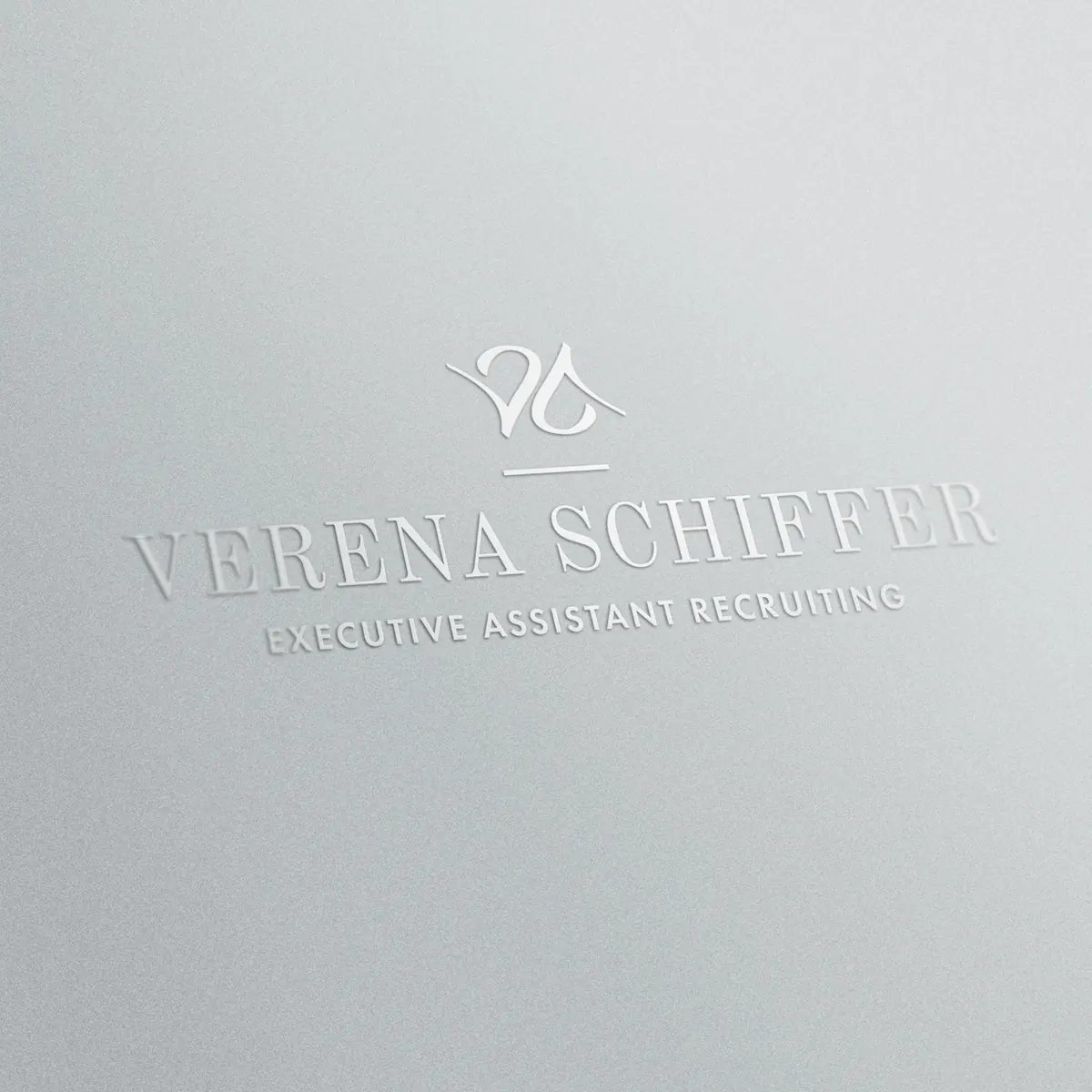
The design basis was in place early and was approved quickly. The fine-tuning of the logo took longer. Once the new logo was in place, the question was how large it should appear in the header, whether the subline "Executive Assistant Recruiting" should run along and how the whole thing behaves on the phone. We compared several variants, each as a real screenshot from the running site rather than as a description. After the comparison Verena Schiffer decided against the subline in the header, because the logo looks clearer without it. This loop was not a detour: only the direct comparison made the decision robust.
A second spot concerned the spacing on the logo band with the reference logos. Here several adjustments were needed until the separation from the neighbouring sections sat right. That too went via interim states with concrete numbers rather than discussions of taste.
One point remained open after the page swap and needs to be followed up: the Rank Math meta data in WordPress is attached to the page, not to the content. When the content was swapped, it therefore stayed in place and no longer matches the respective text. That is known, named and is being coordinated with Ramona Kuchenbaur.
Verena Schiffer's part
This project lives from the client's clarity. Verena Schiffer has been advising managing directors on filling key positions for more than twenty years, and she brought exactly this decisiveness to her own project. Verena Schiffer knew exactly what effect she needed and could name it, not just in adjectives but at concrete spots. She decided swiftly, even against her own earlier preferences, and really looked at every interim stage instead of just waving it through. That she additionally provided photos and references that match the intended level made the design work considerably easier.
Her feedback on the logo was particularly valuable. That she could say clearly after the comparison which variant carries her made the brand sharper at this point.
Result
Verena Schiffer's website today appears as a coherent picture. Logo, typography, colour and imagery interlock, the presence matches the position she actually holds in the market.
Concretely, after the relaunch there is:
- A reworked logo including mark and favicon, plus coordinated variants for header, scroll state and mobile devices
- A single H1 per page, the header wraps cleanly from a single heading at all screen sizes
- Blog posts that flow automatically into the preview areas, without maintenance after every publication
- An unchanged URL and page structure, so that the visibility built up was never at stake
There are no robust conversion figures yet, the relaunch is too fresh for that. That is exactly why it was done this way: because the content basis remained unchanged, the development of the coming months can be attributed to the design. The numbers are being watched.
The client's feedback is already in. Verena Schiffer recognises herself in her site, and her judgement carries weight: professionally she assesses every day whether appearance and substance match.
Classification: web design or rebranding?
The project began as a redesign of a website. It became more. With the reworking of the logo, the definition of the typography and the reordering of the imagery, the end result is a brand presence that carries beyond the website. Whoever derives a business card or a quote template from these guidelines today gets a picture of a piece.
For projects of this kind that is often the more sensible scope. A website is hard to design to a high standard if the logo comes from another era. Tackling both together saves the second round.
Frequently asked questions about website relaunches
Does a website lose its Google rankings in a relaunch?
Not necessarily. Rankings are at risk when URLs or page structure change, as well as with a new content focus. If all of that stays and only the design is renewed, the risk is low. In the project for Verena Schiffer, URLs and page structure were deliberately left untouched, as was the keyword focus.
What is the difference between a redesign and a relaunch?
A redesign changes the design of an existing website while structure and content are preserved. In common usage a relaunch usually means the bigger rebuild with new structure and new content, often with a new system too. The transitions are fluid, what matters is how many levers are moved at the same time.
Does the search engine optimisation have to be redone in a redesign?
No. If the existing optimisation carries in terms of content, it is more sensible to keep it and treat the design separately. That way it remains traceable which change has which effect. A new keyword strategy is a project of its own and should not run along in the same step.
How long does a redesign of an existing website take?
That depends on the scope and on the speed of decisions. For Verena Schiffer, around four weeks lay between the first draft and the go-live of the reworked home page and company page, including the logo redesign and several rounds of coordination.
Can website and logo be reworked at the same time?
Yes, and often that is the better way. A new logo demands that the design of the website be adapted to it anyway. Handling both in one project saves a second round of rebuilding and ensures that type and colour match the imagery.
What does a website redesign cost?
The effort depends on the number of pages and the state of the existing system, plus how much design has to be newly developed. An estimate after a look at the existing site makes sense, because only then does it become visible what can be kept and what has to be rebuilt.
← To the projects