

From a supplied drawing to a technically clean, vectorized mascot that stands alongside the apprentices.
The Brief
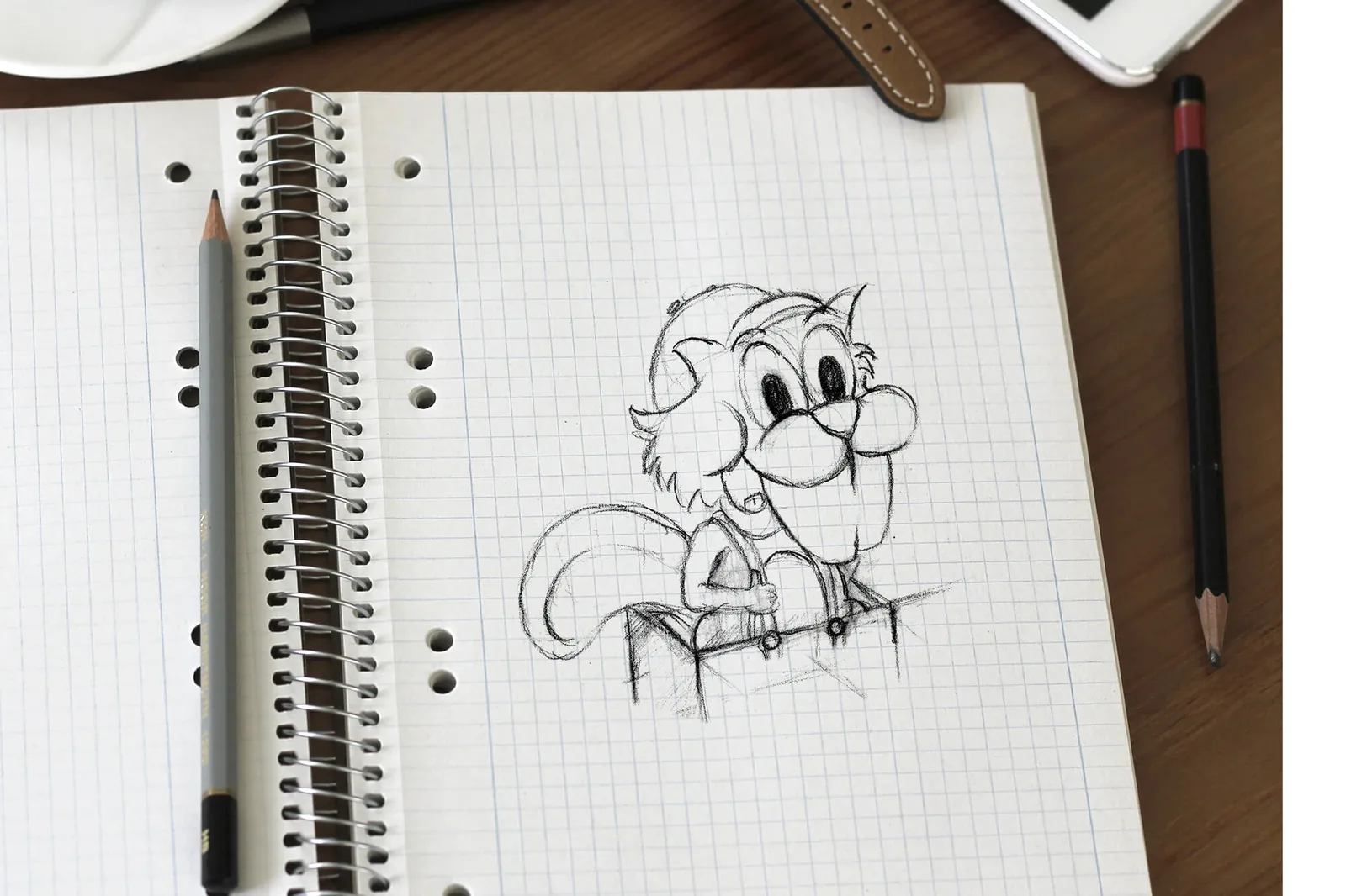
Straub Verpackungen came to me with a drawing of their own, a character with real personality, but a hand-drawn sketch all the same. It needed to become a clean mascot that works everywhere, stays crisp at any size, and fits the company's apprentices. So not a redesign, but respect for what was already there: keeping the idea and giving it a form that holds up technically.
The Process
I worked in three steps. First, cleaning up the hand-drawn original: calming the lines, checking the proportions, smoothing out small inconsistencies without taking away the mascot's expression. Then redrawing the whole thing cleanly. And finally moving it into a vector format, so the character scales freely, from a small print run to a large surface, and looks just as good in every application. The fine line here: making it clean without making it sterile.
Why final artwork & vectorization?
A scanned drawing is pixel-based, and the moment you enlarge it, it turns blurry and frayed at the edges. Final artwork and vectorization turn those pixels into clean paths that scale to any size without losing quality. Which is exactly what a mascot needs when it shows up on a business card one day and on a banner the next.
The Result
The result is a professional, vectorized mascot that turns an analog sketch into a reliable digital asset, ready to use for print and screen at any time. A character that visibly stands alongside the apprentices at Straub Verpackungen while keeping its original handwriting.