

Designing a logo for a retail park sounds pretty dry at first. This time it wasn't.
The Brief
The Meran-Arkaden bring lots of shops together under one roof, and yet they should still feel like a single place. With flair. With a sense of quality. And with that arc towards Merano that brings a Mediterranean way of life into play: strolling, not ticking off a to-do list.
Three things had to come together: the arcade motif, a tangible sense of quality, and the nod to Merano - for a mixed audience that finds everything here, from the sports run (Decathlon among others) to dinner (L'Osteria). And one thing that was quietly taken for granted in the brief: create a look of its own, no well-worn stock elements that get you burned, legally or creatively.
The Journey
At first I was loud. Bold and obvious. I built arches, hinted at columns, put the Mediterranean right up front - and was happy with almost none of it. Then came pencil sketches, crumpled sheets of paper, experiments with typefaces, research.
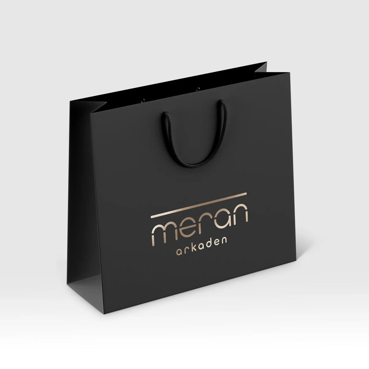
The moment came on a weekend. The idea: don't depict the building, place it into the lettering instead. A rounded typography, a single line drawn straight through, and suddenly the upper curves of the letters stand like arcade arches on columns. There it was. Plain. Simple. Solid.
The loud process beforehand wasn't a detour. It had to happen. A logo is always about a precision that still has to work at the tiniest size - and you don't get there with the first idea.
The Solution
A piece of lettering becomes a building, without anyone having to explain what they're looking at. The curves of the letters carry the arcade motif, the line gives them ground: columns, arches, a covered walkway. Refined, calm, Mediterranean. And the nod to Merano is there, without any cliché.
What emerged in the end wasn't a single logo, but a whole set: one full version and three icon variants for different display sizes, in black and white as well as spot colours, in plenty of formats. Robust from the smallest use case to the large-scale surface, because the logo was meant to hang on several buildings spread across Augsburg.
The Result
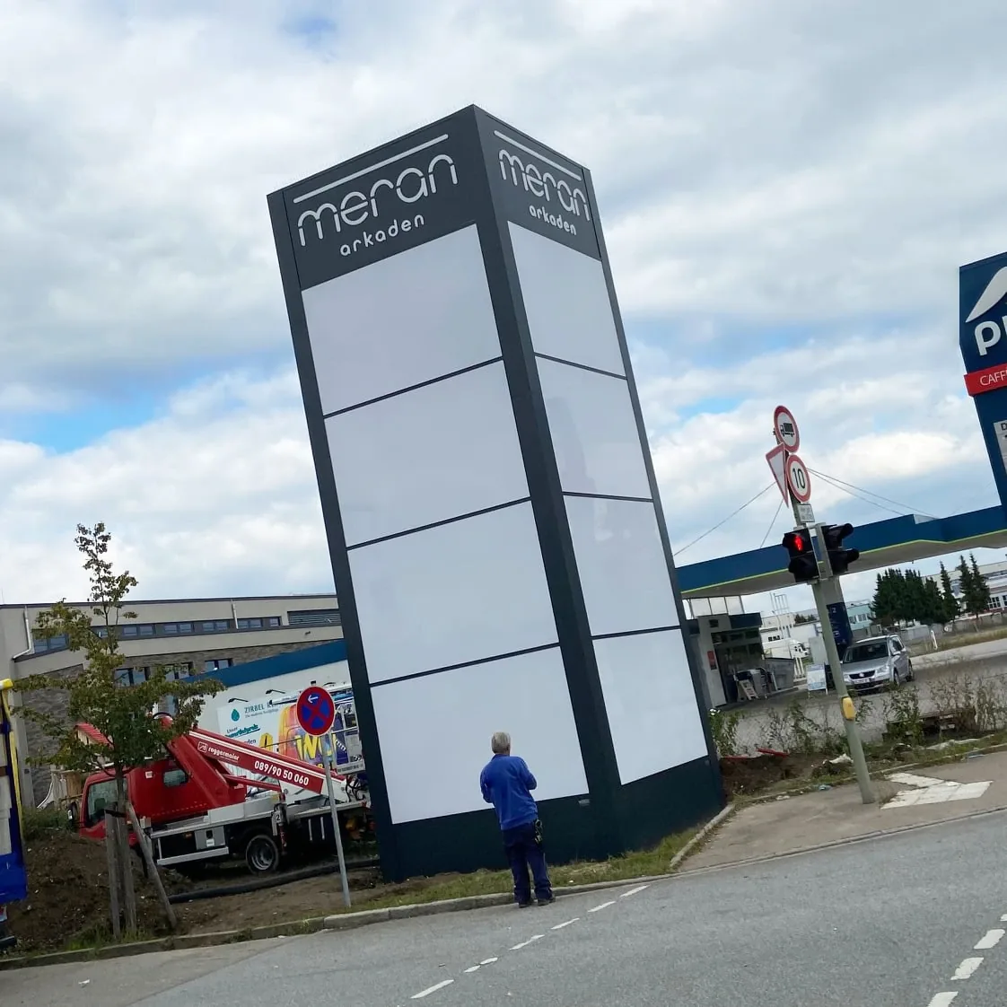
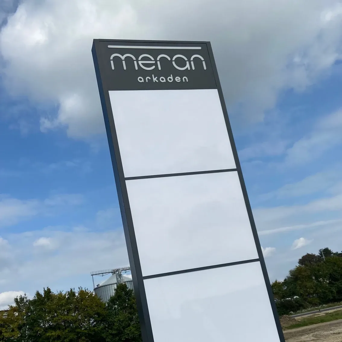
A close collaboration with the client, several rounds of development, and one enormous logo set at the end. The best moment doesn't happen on screen. It happens outside: seeing the logo on the big illuminated sign. That's exactly where it belongs.
“Ms Wullich has already delivered two projects for us: a logo for one of our new property developments and an anniversary logo. With the result – and with the collaboration – I was more than satisfied.”
Lena Trabert, S+P Immobiliengruppe
Sources: Augsburger Nachrichten ↗ · Decathlon Augsburg ↗