

Ein Logo für ein Fachmarktzentrum zu gestalten klingt erst mal nüchtern. Hier war es das nicht.
Designing a logo for a retail park sounds pretty dry at first. This time it wasn't.
Signum pro centro tabernarum fingere primo aspectu ieiunum videtur. Hic non ita erat.
Die Aufgabe
The Brief
Munus
Die Meran-Arkaden vereinen viele Geschäfte unter einem Dach, und sollen trotzdem als ein Ort wahrgenommen werden. Mit Flair. Mit Wertigkeit. Und mit dem Bogen nach Meran, der mediterranes Lebensgefühl ins Spiel bringt: flanieren, nicht abarbeiten.
The Meran-Arkaden bring lots of shops together under one roof, and yet they should still feel like a single place. With flair. With a sense of quality. And with that arc towards Merano that brings a Mediterranean way of life into play: strolling, not ticking off a to-do list.
Meran-Arkaden multas tabernas sub uno tecto coniungunt, et tamen unus locus videri debent. Cum gratia. Cum dignitate. Et cum arcu ad Meran, qui vitam mediterraneam in ludum adducit: ambulare, non negotia conficere.
Drei Dinge mussten zusammen: das Arkaden-Motiv, eine spürbare Hochwertigkeit und der Verweis auf Merano, für eine durchmischte Zielgruppe, die hier vom Sporteinkauf (u.a. Decathlon) bis zum Abendessen (L'Osteria) alles findet. Und eine Selbstverständlichkeit, die im Briefing mitschwang: einen eigenen Look schaffen, keine altbekannten Versatzstücke, an denen man sich rechtlich oder gestalterisch verbrennt.
Three things had to come together: the arcade motif, a tangible sense of quality, and the nod to Merano - for a mixed audience that finds everything here, from the sports run (Decathlon among others) to dinner (L'Osteria). And one thing that was quietly taken for granted in the brief: create a look of its own, no well-worn stock elements that get you burned, legally or creatively.
Tria coniungenda erant: imago arcuum, dignitas quae sentiri potest, et significatio ad Merano, pro turba varia, quae hic omnia invenit, ab emptione rerum athleticarum (inter alia Decathlon) usque ad cenam (L'Osteria). Et unum quod in mandato tacite inerat: speciem propriam creare, nulla membra vetera et trita, quibus quis se aut lege aut arte adurat.
Der Weg
The Journey
Iter
Am Anfang war ich laut. Plakativ. Ich habe Bögen gebaut, Säulen angedeutet, das Mediterrane vorne hingestellt, und war mit kaum etwas zufrieden. Es folgten Bleistiftskizzen, zerknüllte Blätter, Experimente mit Schriften, Recherche.
At first I was loud. Bold and obvious. I built arches, hinted at columns, put the Mediterranean right up front - and was happy with almost none of it. Then came pencil sketches, crumpled sheets of paper, experiments with typefaces, research.
Initio clamosa eram. Nimis aperta. Arcus struxi, columnas adumbravi, mediterraneum in fronte posui, et vix ulla re contenta eram. Secutae sunt adumbrationes plumbeae, chartae corrugatae, experimenta cum litteris, investigatio.
Der Moment kam an einem Wochenende. Die Idee: nicht das Bauwerk abbilden, sondern es in die Schrift legen. Eine runde Typografie, ein Strich, durchgezogen, und plötzlich stehen die oberen Rundungen der Buchstaben wie Arkadenbögen auf Säulen. Da war es. Schlicht. Einfach. Tragfähig.
The moment came on a weekend. The idea: don't depict the building, place it into the lettering instead. A rounded typography, a single line drawn straight through, and suddenly the upper curves of the letters stand like arcade arches on columns. There it was. Plain. Simple. Solid.
Momentum venit fine hebdomadis. Consilium: non aedificium pingere, sed in litteras ipsas ponere. Litterae rotundae, linea una per totum ducta, et subito curvae superiores litterarum velut arcus super columnas stant. Ibi erat. Simplex. Facile. Firmum.
Der laute Prozess davor war kein Umweg. Er musste sein. Ein Logo ist immer Perfektion, die auch in minimalster Größe noch funktionieren muss, und dahin kommt man nicht über die erste Idee.
The loud process beforehand wasn't a detour. It had to happen. A logo is always about a precision that still has to work at the tiniest size - and you don't get there with the first idea.
Ille clamor prior non erat deverticulum. Necessarius erat. Signum semper perfectio est, quae etiam in minima magnitudine valere debet, et eo non pervenitur prima cogitatione.
Die Lösung
The Solution
Solutio
Aus einer Typo wird ein Bauwerk, ohne dass jemand erklären muss, was er sieht. Die Schriftrundungen tragen das Arkaden-Motiv, der Strich gibt ihnen Boden, Säulen, Bögen, ein gedeckter Gang. Wertig, ruhig, mediterran. Und der Verweis auf Meran ist da, ohne Klischee.
A piece of lettering becomes a building, without anyone having to explain what they're looking at. The curves of the letters carry the arcade motif, the line gives them ground: columns, arches, a covered walkway. Refined, calm, Mediterranean. And the nod to Merano is there, without any cliché.
Ex litteris aedificium fit, neque quisquam explicare debet quid videat. Curvae litterarum imaginem arcuum ferunt, linea eis solum dat: columnas, arcus, ambulacrum tectum. Dignum, quietum, mediterraneum. Et significatio ad Meran adest, sine loco communi.
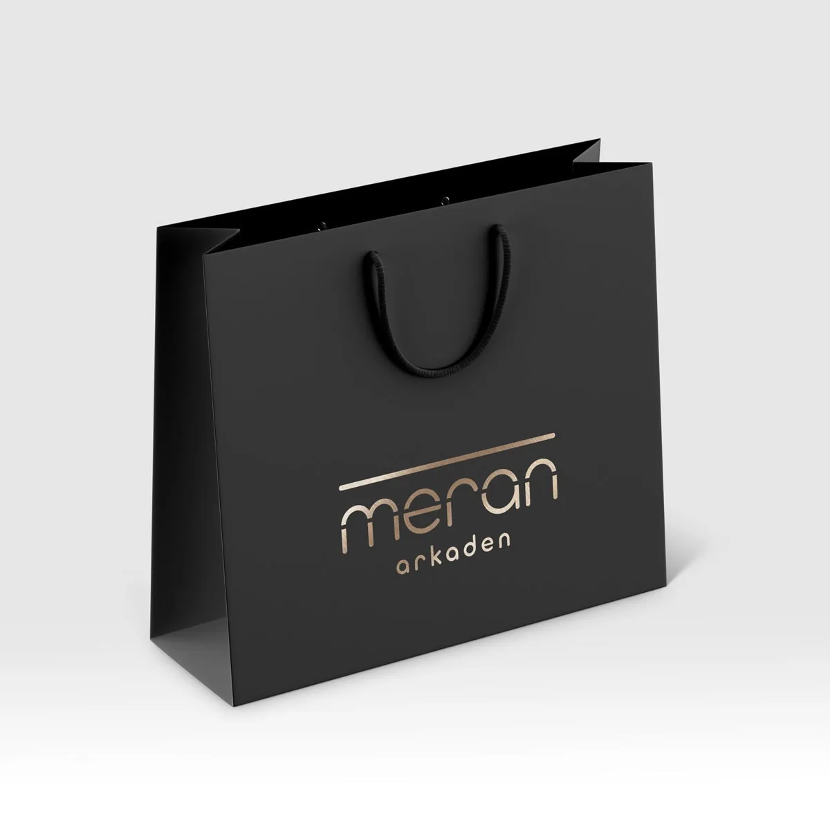
Am Ende stand kein Einzellogo, sondern ein ganzes Set: eine Langversion und drei Icon-Varianten für unterschiedliche Darstellungsgrößen, in Schwarz und Weiß sowie in Sonderfarben, in etlichen Formaten. Belastbar vom kleinen Anwendungsfall bis zur großen Fläche, denn das Logo sollte an mehreren Gebäuden über Augsburg verteilt hängen.
What emerged in the end wasn't a single logo, but a whole set: one full version and three icon variants for different display sizes, in black and white as well as spot colours, in plenty of formats. Robust from the smallest use case to the large-scale surface, because the logo was meant to hang on several buildings spread across Augsburg.
In fine non signum unum stabat, sed corpus integrum: forma longa et tres variationes brevis pro diversis magnitudinibus, nigro et albo necnon coloribus propriis, in pluribus formis. Firmum ab usu minimo usque ad superficiem magnam, nam signum in pluribus aedificiis per Augsburg dispersis pendere debebat.
Das Ergebnis
The Result
Exitus
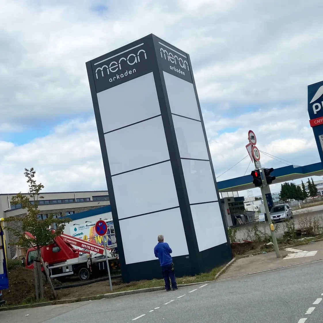
Eine Zusammenarbeit nah am Kunden, mit mehreren Entwicklungsschleifen, und einem Riesen-Logoset am Ende. Der schönste Moment kommt nicht im Programm. Er kommt draußen: das Logo auf dem großen Leuchtschild zu sehen. Genau dort gehört es hin.
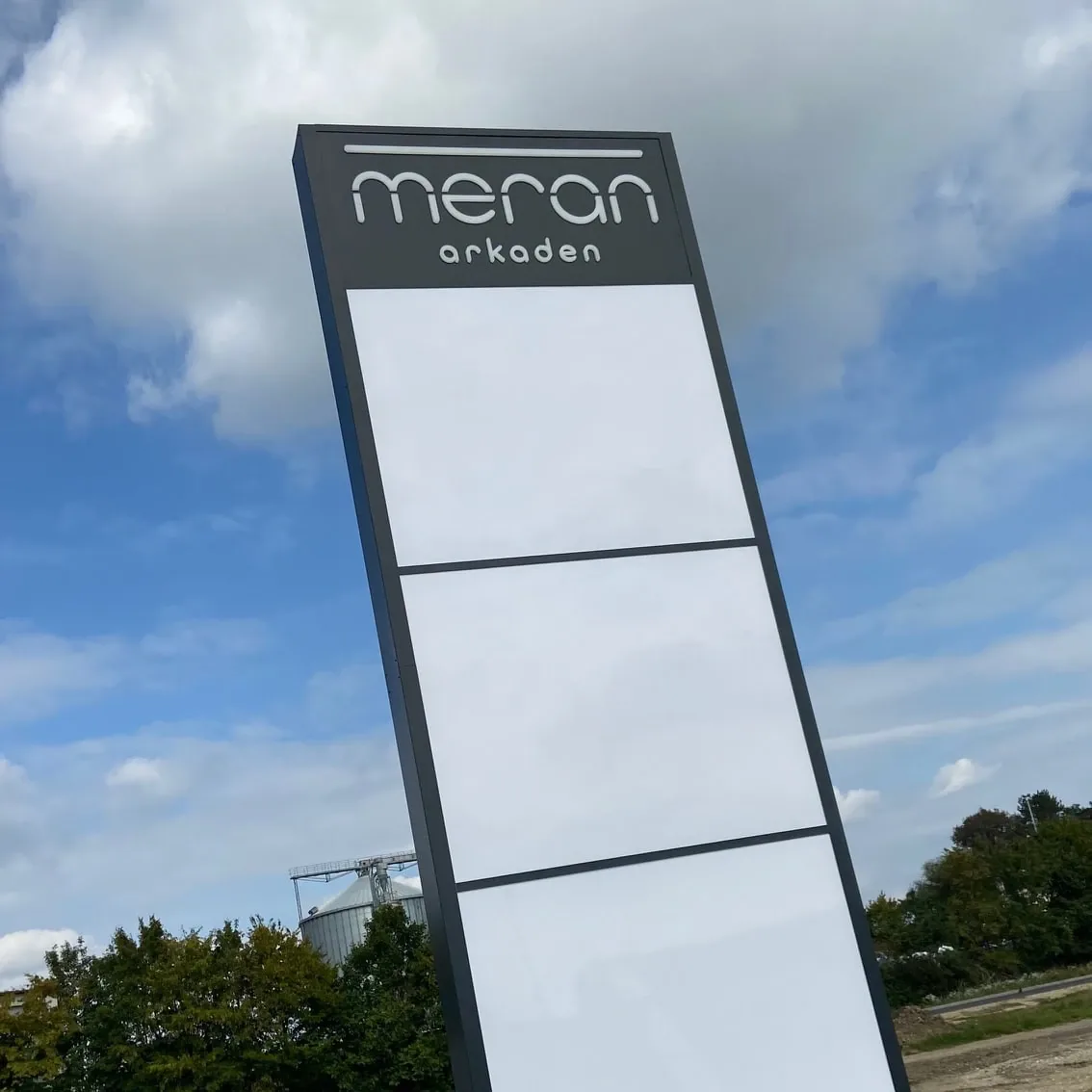
A close collaboration with the client, several rounds of development, and one enormous logo set at the end. The best moment doesn't happen on screen. It happens outside: seeing the logo on the big illuminated sign. That's exactly where it belongs.
Cooperatio prope clientem, cum pluribus orbibus elaborandi, et corpus signorum ingens in fine. Momentum pulcherrimum non in machina venit. Foris venit: signum in magna tabula lucente videre. Ibi prorsus est eius locus.
„Zwei Projekte hat Frau Wullich bereits für uns realisiert: ein Logo für eins unserer neuen Immobilienprojekte und ein Jubiläumslogo. Mit dem Resultat – wie auch mit der Zusammenarbeit – war ich mehr als zufrieden.“
“Ms Wullich has already delivered two projects for us: a logo for one of our new property developments and an anniversary logo. With the result – and with the collaboration – I was more than satisfied.”
„Duo opera Jenny Wullich iam pro nobis perfecit: signum pro uno ex novis aedificiis nostris et signum anniversarium. Exitu – sicut etiam cooperatione – plus quam contenta eram.“
Lena Trabert, S+P Immobiliengruppe
Quellen: Augsburger Nachrichten ↗ · Decathlon Augsburg ↗
Sources: Augsburger Nachrichten ↗ · Decathlon Augsburg ↗
Fontes: Augsburger Nachrichten ↗ · Decathlon Augsburg ↗
