

A whole world, and a single mark to carry it out into the open.
The starting point
Veronika Weinseis wasn't writing a single book, but a whole world, with its own characters, places and mood. What she needed was a mark that could carry that world outward without giving it away: recognizable, but not overloaded, and open enough to work across several parts of the series.
Idea & approach
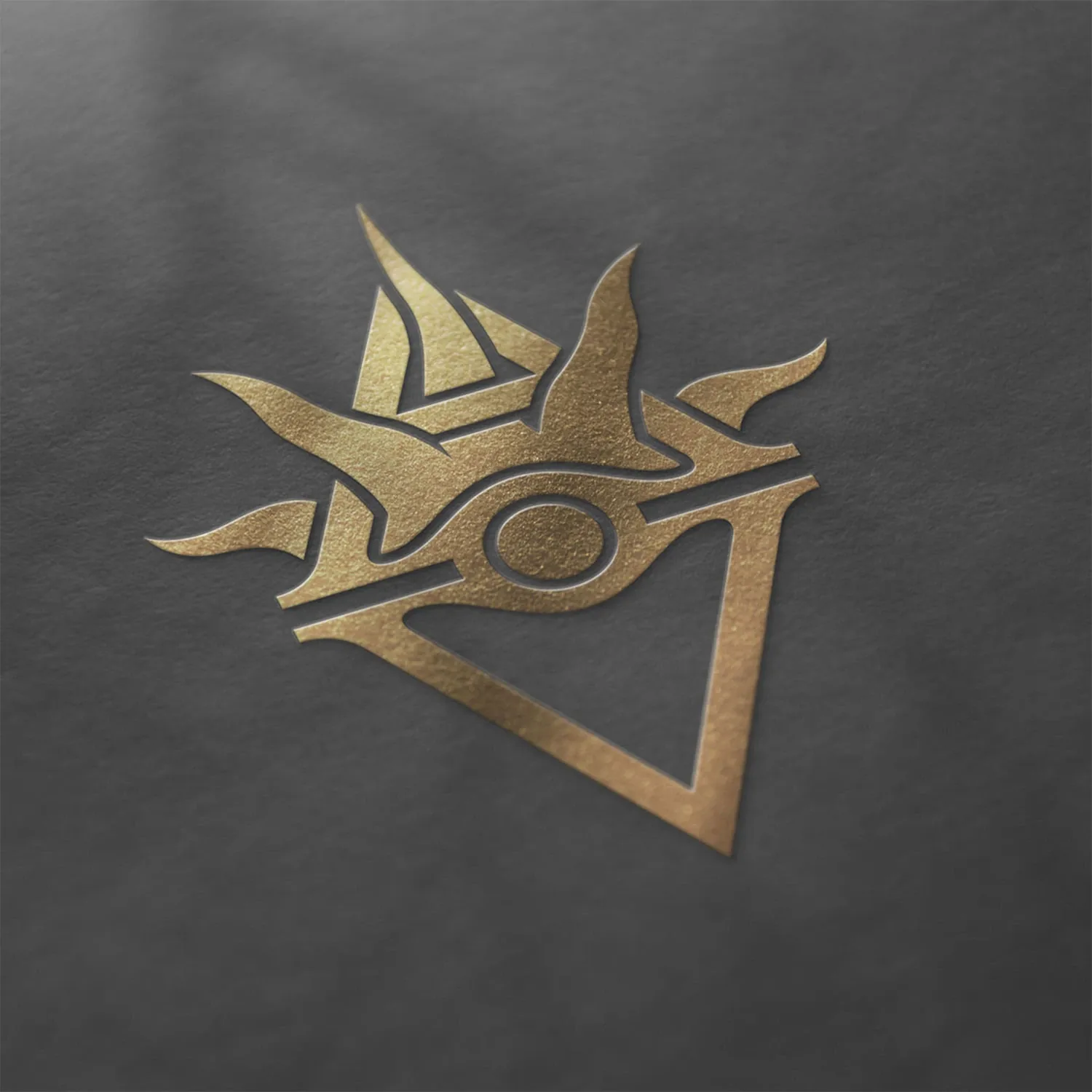
Rather than jumping straight into design, I dug deep into the story first, because a mark that's meant to carry a world has to understand that world first. Out of the recurring motifs in the narrative grew an emblem that pares things down to the essentials and stays flexible enough for book covers, web and social media. It mattered to me that it hints rather than spells everything out, so there's still room for the reader's own imagination.
The result
In the end there were several logos, one for each part of the series, each speaking for itself while still reading as one family. A collaboration with a lot of heart on both sides, and a system of marks that can grow along with the world.
“She brought not only real heart to it, but also the utmost professionalism and a genuine willingness to get to grips with an unfamiliar subject. What came out of it was a wonderful logo – I can only recommend her.”
Veronika Weinseis