

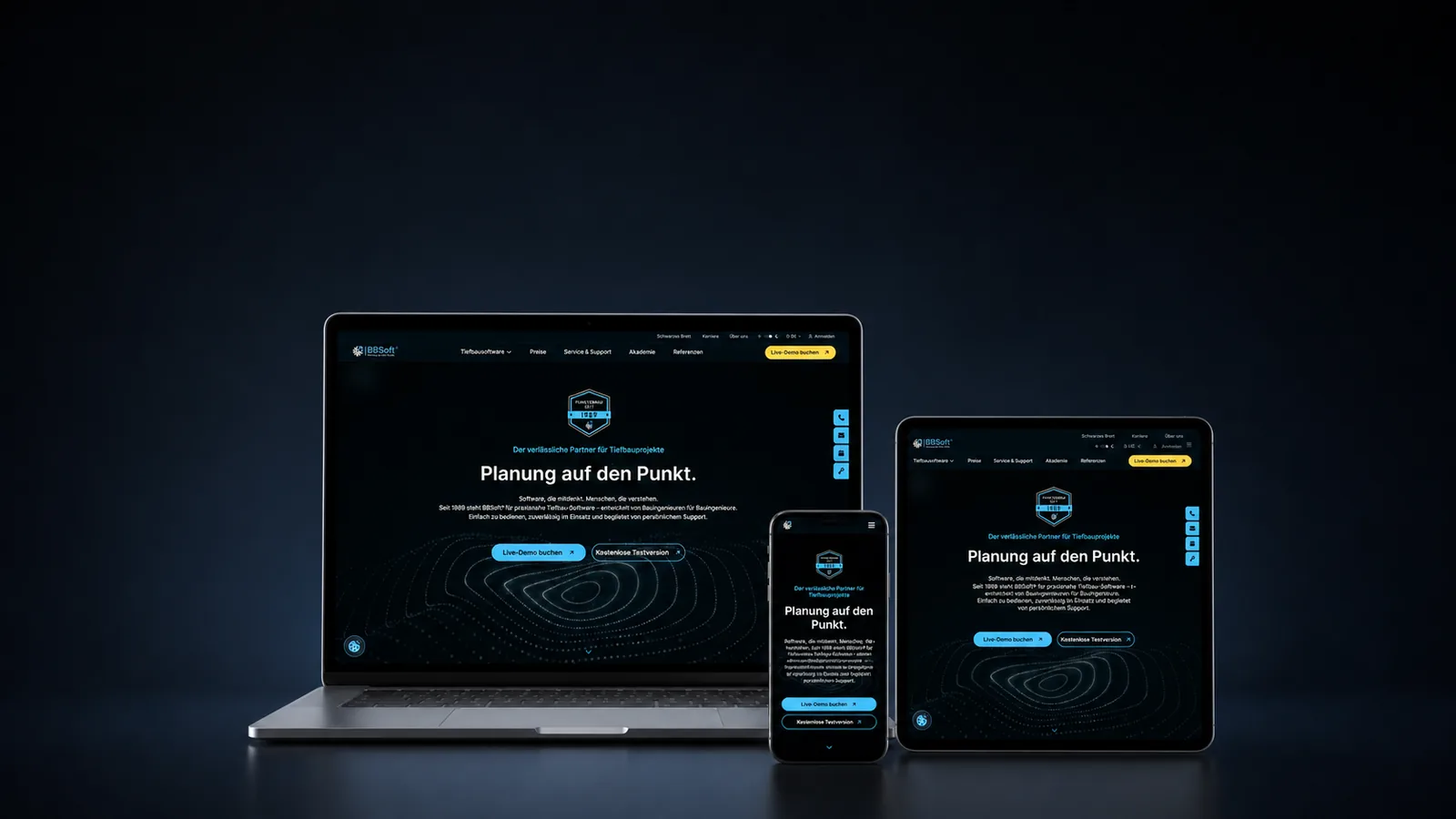
BBSoft has been building software for civil engineering for decades, with loyal customers and a solid SEO foundation. Logo and website had worked well for a long time, but had grown and grown together over the years. A rebranding became a complete website relaunch, and out of that grew a whole brand world. My part was the design: from logo, claim, seals and icons to the web concept.
The starting point
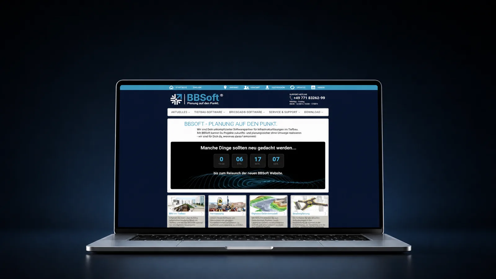
BBSoft builds software for civil engineering. They are very established in their field, have excellent customers and a very solid SEO foundation. The logo had worked well for decades, as had the website. Both had grown together with the audience, and the website had simply kept growing, over years.
Phase 1: the rebranding
The goal: make the core of the brand tangible before anyone talks about a colour or a typeface, inside the company as much as outside.
What became clear: BBSoft lives on relationships. Support is exceptional, the loyalty of existing customers is the real strength, and great importance is placed on treating employees with the utmost appreciation.
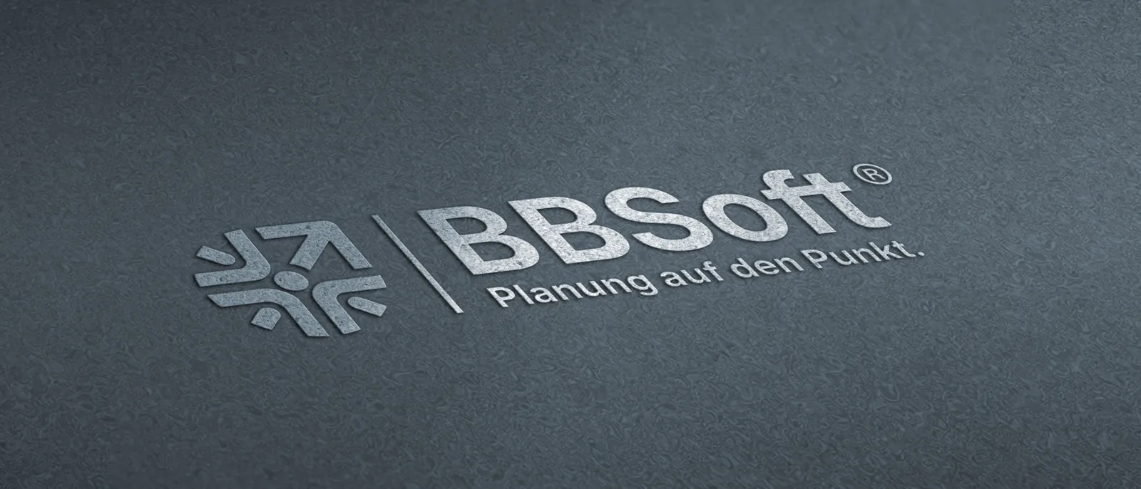
Out of that came a claim and a logo that brought the philosophy to the point in a few words: Planung auf den Punkt, planning to the point.
Phase 2: from rebranding to website
After the branding, BBSoft entrusted us with its website. We went to Donaueschingen and worked out a concept together that included everyone: the BBSoft team, SEO, design and Susanne as copywriter. This website is sensitive, because it is more than a business card. It is a revenue channel, connected to many internal processes and systems.
Design, copy and SEO came from outside; the technical build ran in house. BBSoft has the developer expertise itself and values acting independently, keeping full control of the website and its future development. For us that meant close coordination.
What shifted along the way
The relaunch became a flowing process. Ideas kept arriving, because the work itself showed what was possible. Together with the client we decided what belonged in, and we enjoyed how open they were. Many of those ideas are in practical use today.
The site was noticeably decluttered
The old website had accumulated many single pages over the years. We merged them along the actual areas of expertise and tidied up thoroughly, in a way that kept the existing SEO or carried it across cleanly.
That was one of the big challenges: saying enough for the user to have all the information, yet without ending up in a wall of text. Next to every module stand further modules that join hands. Here too, cross-links were drawn so as not to confuse the user.
Academy and support move to the front
Knowledge and workshops are a strong lever for looking after existing customers. The academy now has its own section with its own visual language and its own content rhythm.
The quiet unique strength: BBSoft has super support, customers reflect that back, and exactly that, with all the client's modesty, is now carried to the outside with a bit of courage.
Ways to get in touch, without riddles
The user should understand on every page where to click when they want to talk: chat, call, callback request, book a demo. No riddles.
What we refused to sacrifice: the SEO
BBSoft was organically in a super position. Ramona analysed the existing SEO state, migrated and extended it. On top of that we thought through a strategy for AI search, because the search behaviour of technical audiences is visibly changing right now and we want to swing along at the front.
What else came out of it
During the project a whole brand world emerged that reaches far beyond the website:
- The new design is lived and applied and is currently forming a corporate design.
- A visual language of its own.
- Seals for product quality, support, academy and partnerships.
- Distinctive videos.
- An icon set of its own.
The process also produced ideas that BBSoft is now carrying on internally in marketing. That was not the original brief. It is what happens when a rebranding truly reaches the people.
What really makes a project like this
The collaboration. And there BBSoft is a dream client: very open to ideas, fast with feedback, at all times appreciative, friendly and focused on solutions. Or in my words: a great company with wonderfully kind people and an expertise that kept astonishing us.
Suggestions were taken up, thought along and returned further developed; a wonderfully beautiful hand in hand. I am loyally bound to this client and will not accept further work from direct competitors. Thank you @BBSoft.
Frequently asked questions about rebranding and relaunch
What does a rebranding include?
More than a new logo. For BBSoft it produced a logo, a claim, seals, an icon set of its own, a visual language and videos. The decisive part comes first: making the core of the brand tangible before anyone talks about colours and typefaces.
How does SEO survive a website relaunch?
With an analysis of the existing state before rebuilding, clean redirects and a structure that merges content instead of deleting it. For BBSoft the organic position was analysed, migrated and extended, plus a strategy for AI search.
Does external design work with in-house development?
Yes, if coordination is close. BBSoft wanted to stay independent and keep full control of the website. Design, copy and SEO came from outside; the in-house developers built it.
Why declutter a website that has grown over years?
Many single pages spread the same message across too many places. Merged along the actual areas of expertise, visitors find what they need faster and the site stays maintainable. What matters is carrying the existing SEO across.
Why did the rebranding turn into a full relaunch?
Because a new brand image makes the old website look visibly old. After the branding, BBSoft entrusted us with the website. The rebuild was conceived together on site and grew during the work with ideas that are in use today.