


Your software works well, it just looks like plenty of others.
There is a moment happening right now that many people go through and almost nobody writes about. You built something with Claude Code, Lovable or a similar tool, and it actually runs. The features work, the database is in place, the login does its job. And then you look at the screen and there it is, that one sobering thought: it is light, tidy, clean and completely interchangeable. Blue buttons, grey cards, the same icon set every other application uses. Nothing about it is wrong, and that is precisely the problem.
This is not because you lack the knowledge. It is because a language model without a brief always builds the average. It has seen millions of interfaces and hands you their mean value, because the mean is the safest suggestion. A model cannot give you a stance you did not give it first.
I have just been through this myself, with a tool I built for my own work with Claude Code. And because the first enquiry followed soon after, asking whether I would do the same for someone else's software, I am writing down how it works. For clients looking for someone to do it, and for designers who want to offer the same.
The real mistake: design as the last step
The usual reflex is to prettify individual spots at the end. The button gets a different colour value, the heading grows, a shadow appears somewhere. The result is an interface full of patches, and because the model falls back to its average with the next change, you do the same work again two weeks later.
With software you build yourself, design is not a coat of paint at the end but a brief at the beginning. The AI does not need feedback on matters of taste, it needs a foundation to derive from. That is what the following is about.
The foundation principle
I call the approach the foundation principle, because it runs in this order and in no other.
First you lay the foundation underneath the application. Not as a description, not as a mood board, but as an existing, working design system. In my case that was my own website, and all of it: typefaces, colour world, look, imagery, icon world, wording and the playful part that belongs to me. That system already existed and did not have to be invented, it only had to be translated.
Then you let the AI translate. For me that was Claude Code, the same tool the application is being built with anyway. The task for the model is no longer „make this prettier“ but „transfer this design system onto this interface“. That is a task a language model solves astonishingly well, because it has to derive rather than invent. For me, that took care of roughly eighty percent, in a single pass.
And then you follow up by hand. The remaining twenty percent are the ones you cannot describe, you have to see them. Spacing that does not breathe; a hierarchy that tips over because two elements are equally loud; or a state nobody thought about, such as the empty list or the long word in the narrow field. I adjust this part directly, because I know how it should look, and because I look at every intermediate result before I go on.
What was actually decided
So this does not stay abstract, here are the decisions that turned the generic first draft into a product of its own.
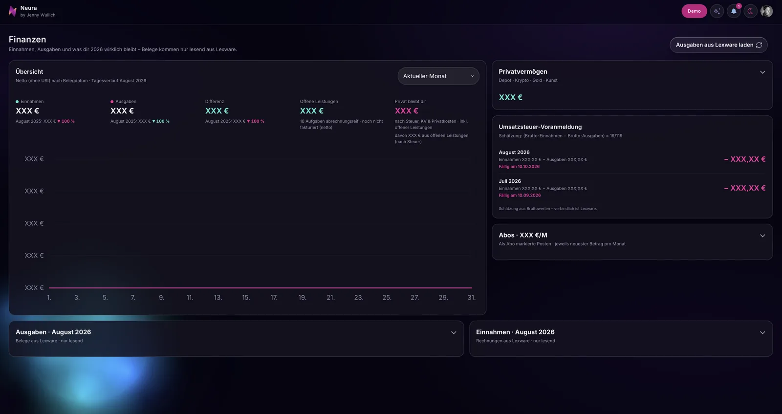
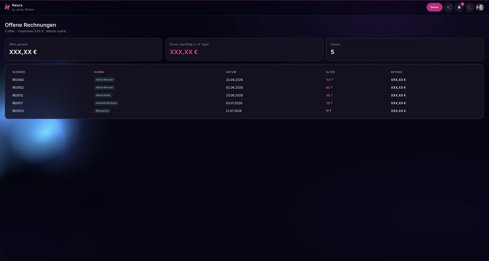
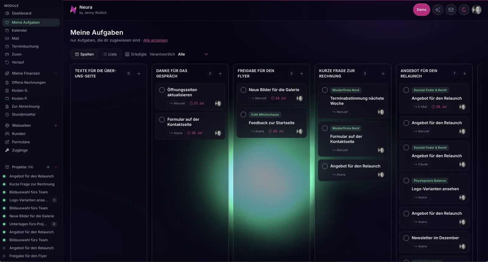
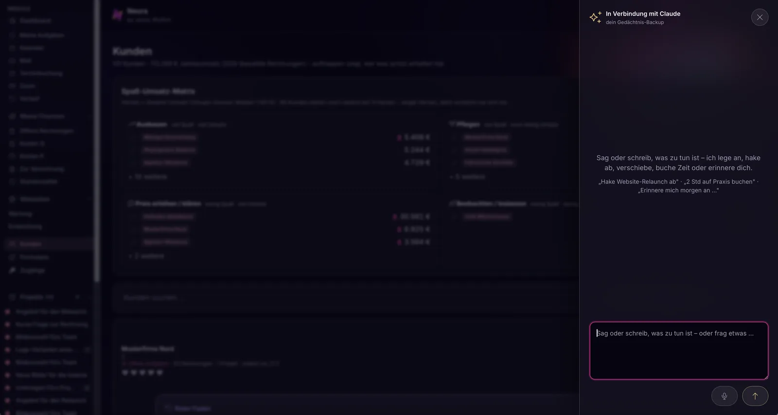
The background went dark, with a violet cast and soft lights at the edges, because that is the imagery of my own presence and not because dark mode happens to be in demand. For actions there is exactly one colour, a strong magenta, and everything positive in the financial area appears in mint. There are no more colours than that, because each additional one would have softened the hierarchy again.
Per screen there is a single highlighted button, everything else stays neutral and quiet. That is the intervention that changed the most, because a language model builds every action equally loud and then the eye lands nowhere.
Recurring meanings were given a fixed sign, for instance a small spark for everything that runs with AI support, so you recognise those places without reading them. Numbers are set large, their label small and grey above them, because while working you look for the value, not the caption. Colour takes over where a column of text would otherwise be needed, for example as a traffic-light dot for the state of a website, which makes an overview considerably faster to read.
And language became part of the design. Under every heading there is one sentence explaining what the area is good for, in the same personal address I use everywhere else. On top of that comes a playful part that makes serious numbers graspable: in my case a matrix that sorts clients by joy and revenue and lets you read off where expanding makes sense and where the price needs to be discussed. Such coined terms are not a quirk, they make a product memorable.
And one point where Neura differs from client projects: Neura is accessible, but for me. It is my tool and I am its only user, so contrast, type sizes, focus and motion are cut to my requirements rather than to an imagined average case. For software other people use, that does not hold. There, contrast values, visible focus rings, keyboard operation and sufficiently large click areas belong in the specification, and from the very beginning, because retrofitting them only ever happens the painful way. That is why, with me, they sit in the same defined values as colour and type instead of in a list that gets ticked off at the end.
Why it is exactly the last twenty percent that make the difference
Neura, my own tool, is meant to support me while working by keeping everything in one place and holding many functions side by side. That sounds harmless and is, in design terms, the hardest case there is, because an application that can do many things at once has no hierarchy of its own. Everything calls out equally loud.
A language model amplifies that, because it treats every function as equally important. It does not know what you need first thing in the morning and what you touch once a month. Only someone who understands how the software is actually used can make that decision. That is why the craft at the end is not cosmetics, but the part that turns a collection of functions into a usable product.
All in all the path took three to four weeks for Neura, across several rounds, because after each step I looked at what the model had done before I took the next one. That is not an inconvenience, that is the method.
What the interface is actually there for
There is one thought that governed every decision in Neura: the software should keep the context, not your head.
And because this post is meant to be honest: I struggle with concentration. But I don’t want that to affect my work, so I stopped fighting it and started looking for solutions. Neura is what came out of that: a tool that keeps hold of the context so I don’t have to do it myself in every moment.
Between a phone call, an email and the next task, I sometimes lose the thread of where I had actually stopped. Most tools leave you alone with that and expect you to remember the context yourself.
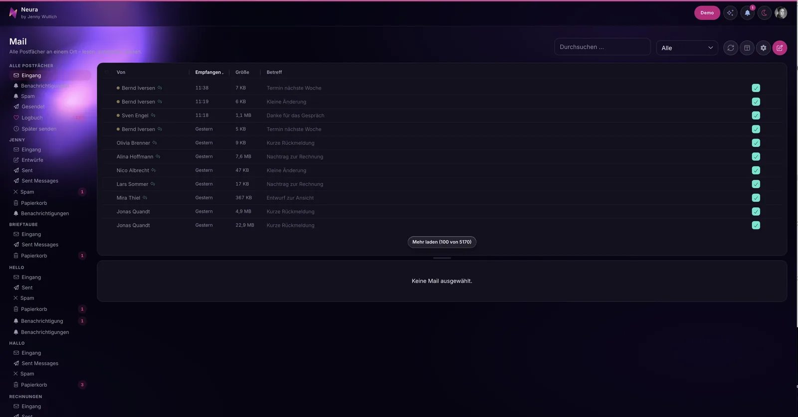
That is why every mailbox in Neura sits in one place, not out of tidiness, but so the software itself notices when a reply to a client has been left lying around, and reminds me before it gets uncomfortable. That is why there is a place that shows, on opening, what was last worked on, and a red thread that keeps the history ready for every client. That is why notes sit where they are needed instead of in a separate program. And that is why every area only ever shows as much as is necessary in that moment, with a clear hierarchy instead of a wall of equally loud elements.
That is the real task of design in software that can do a lot: avoid flooding and make it possible to get back in. An AI does not build that on its own, because it does not know how a working day unfolds. I build tools that think along, because I do not want concentration to be the precondition for good work.
What you need if you want to try it yourself
You need a design system that already exists and holds together. If you have a website whose look you like, you already have one, and then the path is short. If you do not have one, that is the honest point where the work starts earlier, because without a foundation the AI simply repeats its average in a different colour.
You also need concrete values instead of adjectives. A model can do nothing with „modern and high quality“, because it knows a thousand contradictory examples of it. With a defined typeface, a defined colour palette, defined steps and a rule for which type size applies where, it can get to work immediately.
And think about accessibility while you are at it
It is not an extra task for later, it belongs in the same list of values as colour and type. A language model does not build it in on its own, and it will not ask about it either. Retrofitting it is considerably more expensive than thinking about it from the start. A few values that keep you on safe ground:
- Body text not below 16 px, 17 to 18 px reads more comfortably. Line height around one and a half times the type size, line length 60 to 75 characters.
- The smallest type, for captions or labels, not below 12 to 13 px, and at that size all the more with full contrast.
- Contrast: body text at least 4.5:1 against the background, large type from about 24 px (or 19 px bold) at least 3:1. Controls, borders and states also need 3:1.
- Click areas at least 24 × 24 px, on a phone rather 44 × 44 px, with a little space between them.
- A visible focus ring for everyone working with a keyboard: at least 2 px, clearly set off, never simply switched off.
- Never colour alone as the carrier of a meaning. The traffic-light dot needs a word beside it, otherwise it stays mute for colour-blind people.
- Motion only where it is wanted: check prefers-reduced-motion and drop the animations when it is set.
For the typefaces you can happily stay with Google Fonts, it only matters which ones. Faces with open shapes and distinguishable letters read well: Atkinson Hyperlegible was designed specifically for people with low vision and separates I, l and 1 as well as O and 0 very clearly. Inter has a large x-height and is excellent on screen. Source Sans 3 is calm and carries longer texts. IBM Plex Sans stays clear even in number-heavy interfaces. Lexend was drawn with reading speed in mind. For columns of numbers, IBM Plex Mono or JetBrains Mono are worth it, or you switch your typeface to tabular-nums so the digits share a width and amounts line up cleanly.
One request: load those fonts self-hosted from your own project, not straight from Google's servers. Otherwise your users' IP addresses travel along with every page view, and that is something you want to spare both them and yourself.
And you need the willingness to look at every result. I do not follow the AI blindly. I steer it, not the other way around. That is the one place where I am genuinely strict in projects like this, and at the same time it is the reason why something comes out at the end that looks like its sender and not like the tool.
The handover: so it holds when you keep building
The hardest part comes after the design. Because you carry on building, with your developer or with the same AI that built the average before. And with the next feature the question is back on the table: what colour does this button get? If the answer to that lives only in my head, the whole job was a snapshot.
That is why I do not hand over images but rules that live in the code and that a language model can read.
Every value in one place. Colours, type sizes, spacing, corner radii and shadows sit centrally as named variables, not spread across a hundred files. The strong magenta is no longer „#e2358f somewhere in the code“, it carries a name like action, and whoever wants to change it changes it once. That is at the same time the best protection against falling back into the average: there simply is no second place where a new colour could quietly appear.
Building blocks with names and a purpose. Not just „button“, but the one highlighted button, the quiet secondary action, the card, the table row, the empty state. Each with one sentence on when it is used. A model makes astonishingly good decisions as soon as it knows it may choose rather than having to invent.
A rules file the AI reads along. This is the part most people overlook. The specification belongs in the project as text, exactly where the tool looks on every request. It states in full sentences what applies: one highlighted action per screen, no new colours, number large and label small, colour only when it means something. A language model forgets everything between two sessions. The file forgets nothing.
States, not just views. Every building block includes how it looks when there is nothing, when something is loading, when something goes wrong and when the text runs longer than expected. Those are precisely the places where the generic seeps back in later, because nobody built them in the first draft.
A short acceptance list. Five questions to run through after every new feature: is there exactly one highlighted action? Are only defined colours in play? Is the value set larger than its label? Does every colour carry a meaning? Are the empty state, the loading state and the error case built? It takes two minutes and prevents the slow drift back to the mean.
And one walk-through together. I do not hand over by zip file. We go through the interface together and I say, for every decision, why it was made that way. Whoever knows the reason makes the next decision correctly on their own, long after I have left the project.
For clients: what I take on in projects like this
If you have built an application yourself and it should look like your company rather than like a template, then I take on exactly this path. I lay your existing corporate design underneath the software as a foundation, make sure that typeface, colour, icons, imagery and wording apply throughout, bring a hierarchy into the interface, and take care of the states that are missing in the first draft.
What you get is not a package of images that somebody has to rebuild, but a specification that lands in the code: defined values, named building blocks and a handover your developer or your AI tool can carry on with, without everything falling apart again at the next feature.
What I do not do is blindly implement whatever a model suggests. I look at every step, correct, and I will also tell you when something does not sit right with me. That is not strictness for its own sake, it is the reason something ends up standing there that we can both stand behind. If you are looking for someone to wave things through quickly, we are probably not a good match, and that too can be said kindly.
Frequently asked questions
Can I transfer my corporate design into software I built myself?
Yes, and it is the fastest route to a result of your own. It works best in this order: first gather the hard values of your identity in one place, the typefaces with their sizes, the colour values along with their meaning, spacing, corner radii and the tone you speak in. Not a mood board, but a list somebody could copy out. If you have a website whose look you like, that list is essentially already sitting in its stylesheet.
You put that list into the project as a file, right where your AI tool looks on every request, and you give one single clear instruction: transfer this system onto the existing interface without inventing new colours or typefaces. After that you go through it screen by screen and correct what only the eye can see. That is exactly the foundation principle above, in three sentences.
Does the code have to be rebuilt for that?
As a rule, not fundamentally. The logic stays as it is, only the individual values migrate out of the components into one shared place.
Where that place sits depends on what it was built with. In plain CSS it is named variables at the very top of the stylesheet, in the :root block everything else reaches into. With Tailwind the same lives in the theme configuration. In React or Vue a single theme file exporting the values is enough. What matters is only that there is exactly one such place and not three. On top of that comes the rules file for the AI, stating in words when which value applies, so that nobody invents their own colour again at the next feature.
How long does a project like this take?
The big leap happens early and fast, the fine work takes the time. For my own tool it was three to four weeks with several rounds of review.
Do I need Figma for this?
Not necessarily. What matters is not the tool but that the specifications exist as concrete values and arrive in the code. With Neura the design took shape entirely in my head and went straight into the code; by now I work without Figma altogether. If a team wants to look along and sign off on intermediate states, a draft can still make sense. On your own it is usually a detour.
What if I do not have a corporate design yet?
That depends on your goal. If the software mainly runs for you yourself, the corporate design may just as well emerge while building. You are making dozens of small decisions about colour, type and tone anyway; sort them once and write them down, and you end up with a system that also carries a website and print materials. For me it was the other way round, the website came first, which is why the path was short.
If the software faces outwards, towards clients or investors, I would start with the brand. Otherwise the software decides what your company looks like, instead of the other way around.
Is it worth it for an MVP?
MVP stands for minimum viable product: the first running version that does just enough to be shown to real people. And yes, that is exactly where it pays off. An MVP is often the first impression on clients or investors, and an interchangeable look becomes expensive at precisely that moment.
What happens if I keep building myself after the handover?
That is exactly what the handover is made for. In practice you get three things: one file with all the values, the adapted building blocks, and a rules file that explains in full sentences what applies.
If your project lives in Git, it arrives as its own branch or a pull request that you review calmly and then merge. Nothing gets overwritten behind your back, and you can go back at any time. Without Git you get the same files as a package, with a short note on what goes where.
Setting it up takes minutes, not hours. The values file is included once centrally, in the same place your other CSS is loaded. The rules file goes unchanged into the project directory, exactly where your AI tool looks by itself, with Claude Code for instance as a project file in the root. If you work with a builder such as Lovable, the rules go into the project instructions instead and the values into the theme settings.
And then we walk through it together once, half an hour is usually enough: pull, look, merge. While we do, I show you with a real example how to phrase the next feature so that it keeps to the rules. After that you do not need me for it.
And if you are currently looking at an interface that works but does not look like you: that is no reason to doubt yourself. It is a completely normal in-between state, and you are in rather good company right now. Just write to me, I will look at it calmly and tell you honestly whether your existing identity is enough of a foundation and what the shortest path there would be. Including when the answer is that you will manage this perfectly well on your own.