

Design für selbst gebaute Software: Warum die KI Dein Corporate Design braucht

About Me
Jenny Wullich

Deine Software funktioniert gut, doch sie sieht aus wie viele andere.

Es gibt gerade einen Moment, den viele erleben und über den kaum jemand schreibt. Du hast mit Claude Code, Lovable oder einem ähnlichen Werkzeug etwas gebaut, das tatsächlich läuft. Die Funktionen sitzen, die Datenbank steht, der Login geht. Und dann schaust Du auf den Bildschirm und da ist diese eine Ernüchterung: Es ist hell, aufgeräumt, sauber und vollkommen austauschbar. Blaue Buttons, graue Karten, das gleiche Icon-Set, das jede zweite Anwendung benutzt. Nichts daran ist falsch, und genau das ist das Problem.

Das liegt nicht daran, dass Du zu wenig Ahnung hättest. Es liegt daran, dass ein Sprachmodell ohne Vorgabe immer den Durchschnitt baut. Es hat Millionen Oberflächen gesehen und liefert Dir deren Mittelwert, weil der Mittelwert der sicherste Vorschlag ist. Ein Modell kann Dir keine Haltung geben, die Du ihm nicht vorher gegeben hast.

Ich habe das gerade selbst durchlaufen, mit einem Werkzeug, das ich mit Claude Code für meine eigene Arbeit gebaut habe. Und weil danach die erste Anfrage kam, ob ich das auch für fremde Software mache, schreibe ich hier auf, wie es funktioniert. Für Kunden, die jemanden dafür suchen, und für Designerinnen und Designer, die dasselbe anbieten wollen.
Your software works well, it just looks like plenty of others.

There is a moment happening right now that many people go through and almost nobody writes about. You built something with Claude Code, Lovable or a similar tool, and it actually runs. The features work, the database is in place, the login does its job. And then you look at the screen and there it is, that one sobering thought: it is light, tidy, clean and completely interchangeable. Blue buttons, grey cards, the same icon set every other application uses. Nothing about it is wrong, and that is precisely the problem.

This is not because you lack the knowledge. It is because a language model without a brief always builds the average. It has seen millions of interfaces and hands you their mean value, because the mean is the safest suggestion. A model cannot give you a stance you did not give it first.

I have just been through this myself, with a tool I built for my own work with Claude Code. And because the first enquiry followed soon after, asking whether I would do the same for someone else's software, I am writing down how it works. For clients looking for someone to do it, and for designers who want to offer the same.

Programma tuum bene valet, sed multis aliis simile videtur.

Est momentum quoddam, quod multi nunc experiuntur et de quo vix quisquam scribit. Aliquid cum Claude Code, cum Lovable aut simili instrumento aedificasti, quod re vera currit. Munera sedent, thesaurus datorum stat, aditus patet. Deinde in quadrum spectas et illa una desperatio adest: clarum est, compositum, purum et prorsus permutabile. Pulsabula caerulea, chartae cinereae, eadem signorum copia qua altera quaeque applicatio utitur. Nihil in eo falsum est, et hoc ipsum est vitium.

Non ideo accidit, quod tibi scientia deest. Accidit, quod exemplar linguae sine praescripto semper medium aedificat. Decies centena milia superficierum vidit et tibi mediam earum rationem tradit, quia medium tutissimum consilium est. Exemplar tibi habitum animi dare non potest, quem ei prius non dedisti.

Hoc ipsa modo perlustravi, instrumento quod ope Claude Code ad opus meum aedificavi. Et quia deinde prima rogatio venit, num idem alienis programmatibus facerem, hic scribo quomodo res procedat. Clientibus qui talem quaerunt, et artificibus qui idem offerre volunt.

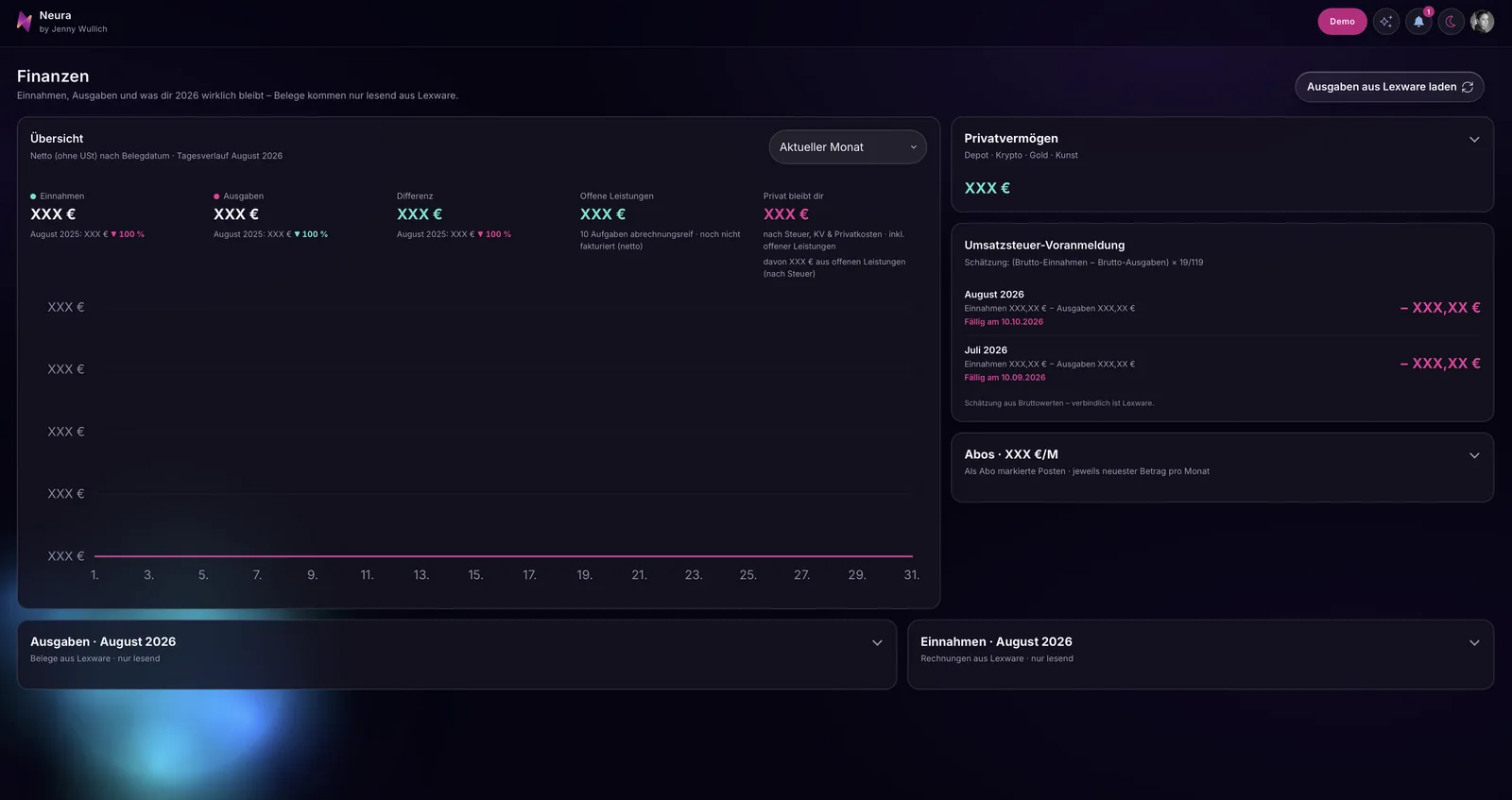
Dashboard des Werkzeugs Neura im Demo-Modus: große Kennzahlen mit kleiner, grauer Bezeichnung darüber, daneben ein Verlaufsdiagramm und eine Aufteilung des Umsatzes. Alle Namen und Zahlen sind Platzhalter.
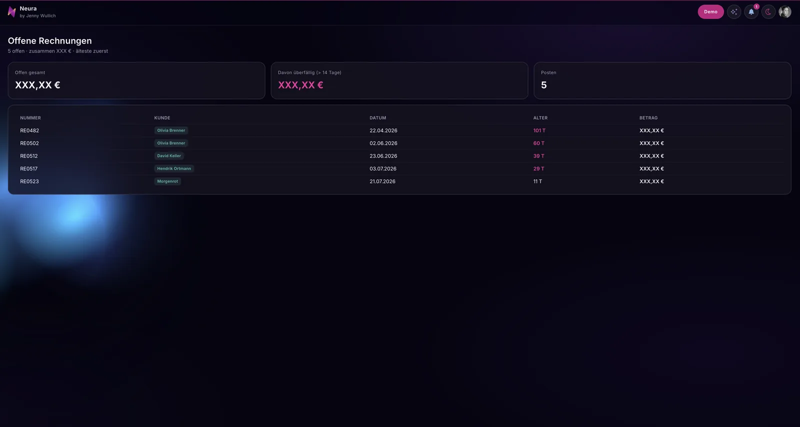
Die Aufnahmen stammen aus dem Demo-Modus, sämtliche Namen und Zahlen sind erfunden.
The screenshots come from demo mode; every name and figure is invented.
Imagines ex modo demonstrativo sumptae sunt; omnia nomina et numeri ficti sunt.

Der eigentliche Fehler: Design als letzter Schritt

Der übliche Reflex ist, am Ende einzelne Stellen zu verschönern. Der Button bekommt einen anderen Farbwert, die Überschrift wird größer, irgendwo kommt ein Schatten dazu. Das Ergebnis ist eine Oberfläche mit Flicken, und weil das Modell bei der nächsten Änderung wieder auf seinen Durchschnitt zurückfällt, machst Du dieselbe Arbeit in zwei Wochen erneut.

Design ist bei selbst gebauter Software kein Anstrich am Ende, sondern eine Vorgabe am Anfang. Die KI braucht kein Feedback zu Geschmacksfragen, sie braucht ein Fundament, aus dem sie ableiten kann. Genau darum geht es im Folgenden.

Das Fundamentprinzip

Ich nenne das Vorgehen das Fundamentprinzip, weil es in dieser Reihenfolge läuft und in keiner anderen.

Zuerst legst Du das Fundament unter die Anwendung. Nicht als Beschreibung, nicht als Stimmungsbild, sondern als vorhandenes, funktionierendes Gestaltungssystem. Bei mir war das meine eigene Website, und zwar vollständig: Schriften, Farbwelt, Look, Bildwelt, Iconwelt, Wording und der spielerische Anteil, der bei mir dazugehört. Dieses System existierte bereits und musste nicht erfunden werden, es musste nur übersetzt werden.

Dann lässt Du die KI übersetzen. Bei mir war das Claude Code, also dasselbe Werkzeug, mit dem die Anwendung ohnehin entsteht. Die Aufgabe an das Modell lautet nicht mehr „mach das schöner“, sondern „übertrage dieses Gestaltungssystem auf diese Oberfläche“. Das ist eine Aufgabe, die ein Sprachmodell erstaunlich gut lösen kann, weil es ableiten und nicht erfinden muss. Bei mir waren damit ungefähr achtzig Prozent erledigt, und zwar in einem Durchgang.

Und danach ziehst Du von Hand nach. Die restlichen zwanzig Prozent sind die, die man nicht beschreiben kann, sondern sehen muss. Abstände, die nicht atmen; eine Hierarchie, die kippt, weil zwei Elemente gleich laut sind, oder ein Zustand, an den niemand gedacht hat, etwa die leere Liste oder das lange Wort im engen Feld. Diesen Teil justiere ich direkt, weil ich weiß, wie es aussehen soll, und weil ich mir jedes Zwischenergebnis anschaue, bevor ich weitergehe.
The real mistake: design as the last step

The usual reflex is to prettify individual spots at the end. The button gets a different colour value, the heading grows, a shadow appears somewhere. The result is an interface full of patches, and because the model falls back to its average with the next change, you do the same work again two weeks later.

With software you build yourself, design is not a coat of paint at the end but a brief at the beginning. The AI does not need feedback on matters of taste, it needs a foundation to derive from. That is what the following is about.

The foundation principle

I call the approach the foundation principle, because it runs in this order and in no other.

First you lay the foundation underneath the application. Not as a description, not as a mood board, but as an existing, working design system. In my case that was my own website, and all of it: typefaces, colour world, look, imagery, icon world, wording and the playful part that belongs to me. That system already existed and did not have to be invented, it only had to be translated.

Then you let the AI translate. For me that was Claude Code, the same tool the application is being built with anyway. The task for the model is no longer „make this prettier“ but „transfer this design system onto this interface“. That is a task a language model solves astonishingly well, because it has to derive rather than invent. For me, that took care of roughly eighty percent, in a single pass.

And then you follow up by hand. The remaining twenty percent are the ones you cannot describe, you have to see them. Spacing that does not breathe; a hierarchy that tips over because two elements are equally loud; or a state nobody thought about, such as the empty list or the long word in the narrow field. I adjust this part directly, because I know how it should look, and because I look at every intermediate result before I go on.

Verum vitium: forma tamquam ultimus gradus

Mos vulgaris est singula loca in fine ornare. Pulsabulum alium colorem accipit, titulus maior fit, alicubi umbra additur. Exitus est superficies pannis consuta, et quia exemplar in proxima mutatione rursus ad medium suum relabitur, idem opus post duas hebdomadas iterum facis.

In programmate a te ipso aedificato forma non est color in fine illitus, sed praescriptum in initio. Intellegentia artificialis non eget iudicio de gustu, sed fundamento ex quo derivare possit. De hoc ipso agitur infra.

Principium fundamenti

Hanc rationem principium fundamenti appello, quia hoc ordine procedit et nullo alio.

Primum fundamentum sub applicationem substruis. Non ut descriptionem, non ut imaginem animi, sed ut systema formandi quod iam est et valet. Apud me id erat pagina mea propria, et quidem tota: litterae, mundus colorum, species, mundus imaginum, mundus signorum, verba et pars illa ludicra quae ad me pertinet. Hoc systema iam exstabat neque inveniendum erat, sed tantum transferendum.

Deinde intellegentiam artificialem transferre iubes. Apud me id erat Claude Code, idem instrumentum quo applicatio utique aedificatur. Mandatum ad exemplar non iam est „fac hoc pulchrius“, sed „transfer hoc systema formandi in hanc superficiem“. Id mandatum exemplar linguae mirum in modum bene solvit, quia derivare debet, non invenire. Apud me sic fere octoginta centesimae confectae sunt, et quidem uno cursu.

Postea manu corrigis. Reliquae viginti centesimae eae sunt, quas describere non potes, sed videre debes. Intervalla quae non spirant; ordo qui vacillat, quia duo elementa aeque clamant; aut status de quo nemo cogitavit, velut index vacuus aut verbum longum in angusto campo. Hanc partem ipsa tempero, quia scio qualis esse debeat, et quia singulos exitus intermedios inspicio, priusquam ulterius progredior.

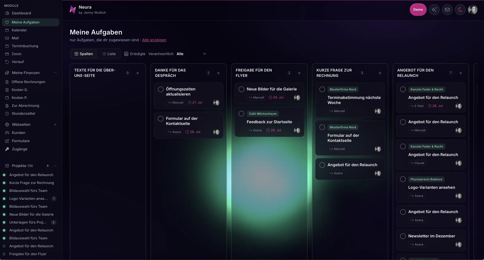
Aufgabenansicht in Spalten: jede Karte nennt Titel, Herkunft und Frist, hervorgehoben ist nur eine einzige Aktion. Alle Projekt- und Kundennamen sind Platzhalter.
Ein Hauptknopf, ruhige Nebenaktionen, und jede Karte zeigt, woher die Aufgabe kommt.
One main button, quiet secondary actions, and every card shows where the task came from.
Unum pulsabulum principale, actiones secundae quietae, et quaeque charta ostendit unde munus veniat.

Was dabei konkret entschieden wurde

Damit das nicht abstrakt bleibt, hier die Entscheidungen, die aus dem generischen Erstwurf ein eigenständiges Produkt gemacht haben.

Der Grund wurde dunkel, mit einem violetten Einschlag und weichen Lichtern an den Rändern, weil das die Bildwelt meines Auftritts ist und nicht, weil Dunkelmodus gerade gefragt ist. Für Aktionen gibt es genau eine Farbe, ein kräftiges Magenta, und alles Positive im Finanzbereich erscheint in Mint. Mehr Farben gibt es nicht, denn jede weitere hätte die Rangfolge wieder aufgeweicht.

Pro Bildschirm existiert ein einziger hervorgehobener Knopf, alles Weitere bleibt neutral und leise. Das ist der Eingriff, der am meisten verändert hat, weil ein Sprachmodell jede Aktion gleich laut baut und der Blick dann nirgends landet.

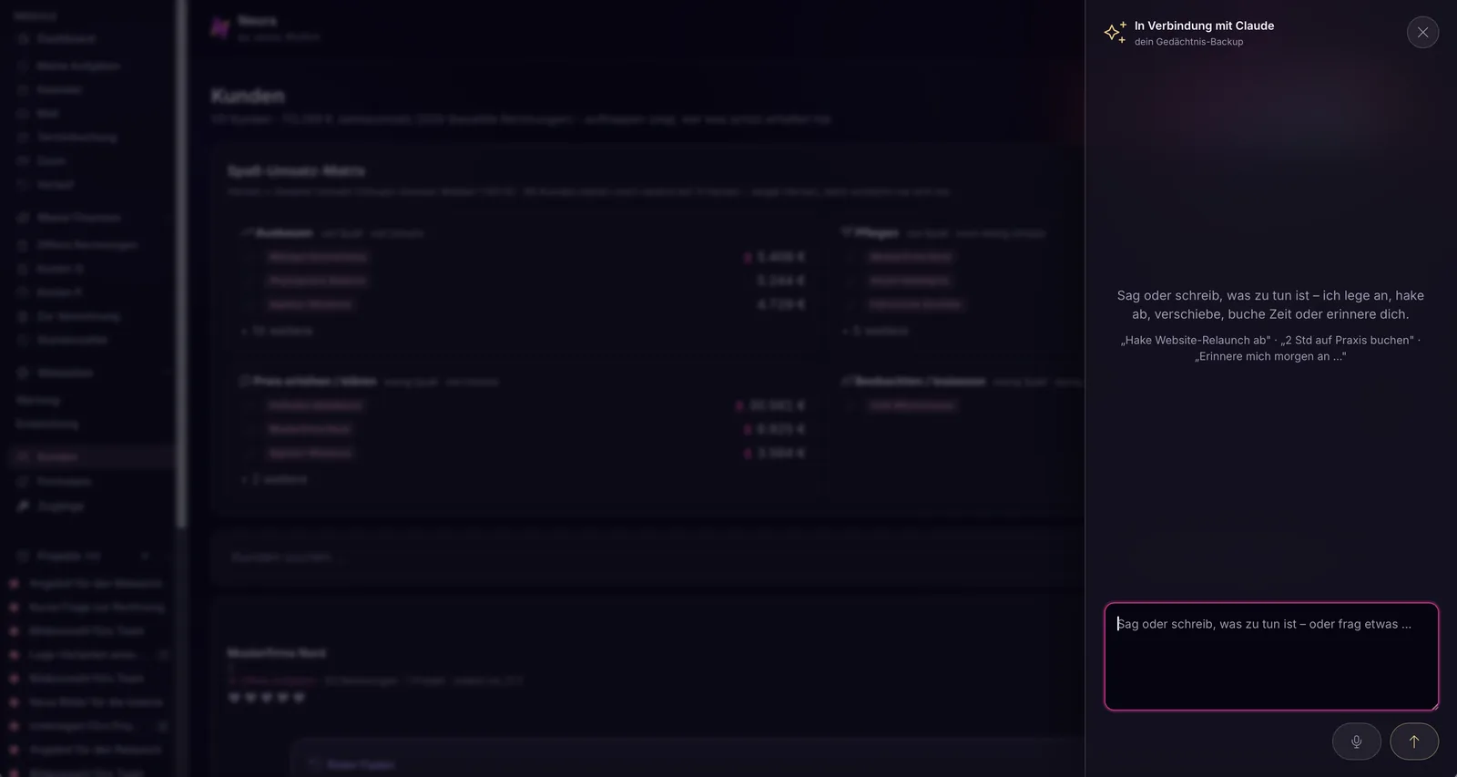
Wiederkehrende Bedeutungen bekamen ein festes Zeichen, etwa einen kleinen Funken für alles, was KI-gestützt abläuft, sodass man diese Stellen erkennt, ohne sie zu lesen. Zahlen stehen groß, ihre Bezeichnung klein und grau darüber, weil man beim Arbeiten den Wert sucht und nicht die Beschriftung. Farbe übernimmt dort, wo sonst eine Textspalte stehen müsste, etwa als Ampelpunkt für den Zustand einer Website, was eine Übersicht erheblich schneller lesbar macht.

Und die Sprache wurde Teil der Gestaltung. Unter jeder Überschrift steht ein Satz, der erklärt, wozu der Bereich gut ist, in derselben persönlichen Ansprache, die ich auch sonst benutze. Dazu kommt ein spielerischer Anteil, der ernsthafte Zahlen begreifbar macht, bei mir zum Beispiel eine Matrix, die Kunden nach Freude und Umsatz sortiert und daraus ablesbar macht, wo Ausbauen sinnvoll ist und wo über den Preis gesprochen werden muss. Solche eigenen Begriffe sind kein Spleen, sie machen ein Produkt merkfähig.

Und ein Punkt, der bei Neura anders liegt als in Kundenprojekten: Neura ist barrierefrei, aber für mich. Es ist mein Werkzeug und ich bin die einzige Nutzerin, also sind Kontrast, Schriftgrößen, Fokus und Bewegung genau auf meine Anforderungen zugeschnitten und nicht auf einen gedachten Durchschnittsfall. Bei Software, die andere benutzen, gilt das nicht. Da gehören Kontrastwerte, sichtbare Fokusrahmen, Tastaturbedienung und ausreichend große Klickflächen in die Vorgaben, und zwar von Anfang an, weil sie sich nachträglich nur mit Schmerzen einbauen lassen. Deshalb stehen sie bei mir in denselben festgelegten Werten wie Farbe und Schrift, statt in einer Liste, die am Ende abgehakt wird.

Warum genau die letzten zwanzig Prozent den Unterschied machen

Neura, mein eigenes Werkzeug, soll mich beim Arbeiten unterstützen, indem alles an einem Ort liegt und viele Funktionen nebeneinander bereitstehen. Das klingt harmlos und ist gestalterisch der schwierigste Fall überhaupt, denn eine Anwendung, die vieles gleichzeitig kann, hat von sich aus keine Rangfolge. Alles ruft gleich laut.

Ein Sprachmodell verstärkt das, weil es jede Funktion gleich wichtig behandelt. Es weiß nicht, was Du morgens zuerst brauchst und was Du einmal im Monat anfasst. Diese Entscheidung kann nur jemand treffen, der versteht, wie mit der Software tatsächlich gearbeitet wird. Deshalb ist der handwerkliche Teil am Ende nicht Kosmetik, sondern der Teil, der aus einer Sammlung von Funktionen ein benutzbares Produkt macht.

Insgesamt hat der Weg bei Neura drei bis vier Wochen gedauert, mit mehreren Runden, weil ich nach jedem Schritt geschaut habe, was das Modell gemacht hat, bevor ich den nächsten gegangen bin. Das ist kein Umstand, das ist die Methode.
What was actually decided

So this does not stay abstract, here are the decisions that turned the generic first draft into a product of its own.

The background went dark, with a violet cast and soft lights at the edges, because that is the imagery of my own presence and not because dark mode happens to be in demand. For actions there is exactly one colour, a strong magenta, and everything positive in the financial area appears in mint. There are no more colours than that, because each additional one would have softened the hierarchy again.

Per screen there is a single highlighted button, everything else stays neutral and quiet. That is the intervention that changed the most, because a language model builds every action equally loud and then the eye lands nowhere.

Recurring meanings were given a fixed sign, for instance a small spark for everything that runs with AI support, so you recognise those places without reading them. Numbers are set large, their label small and grey above them, because while working you look for the value, not the caption. Colour takes over where a column of text would otherwise be needed, for example as a traffic-light dot for the state of a website, which makes an overview considerably faster to read.

And language became part of the design. Under every heading there is one sentence explaining what the area is good for, in the same personal address I use everywhere else. On top of that comes a playful part that makes serious numbers graspable: in my case a matrix that sorts clients by joy and revenue and lets you read off where expanding makes sense and where the price needs to be discussed. Such coined terms are not a quirk, they make a product memorable.

And one point where Neura differs from client projects: Neura is accessible, but for me. It is my tool and I am its only user, so contrast, type sizes, focus and motion are cut to my requirements rather than to an imagined average case. For software other people use, that does not hold. There, contrast values, visible focus rings, keyboard operation and sufficiently large click areas belong in the specification, and from the very beginning, because retrofitting them only ever happens the painful way. That is why, with me, they sit in the same defined values as colour and type instead of in a list that gets ticked off at the end.

Why it is exactly the last twenty percent that make the difference

Neura, my own tool, is meant to support me while working by keeping everything in one place and holding many functions side by side. That sounds harmless and is, in design terms, the hardest case there is, because an application that can do many things at once has no hierarchy of its own. Everything calls out equally loud.

A language model amplifies that, because it treats every function as equally important. It does not know what you need first thing in the morning and what you touch once a month. Only someone who understands how the software is actually used can make that decision. That is why the craft at the end is not cosmetics, but the part that turns a collection of functions into a usable product.

All in all the path took three to four weeks for Neura, across several rounds, because after each step I looked at what the model had done before I took the next one. That is not an inconvenience, that is the method.

Quid re vera constitutum sit

Ne haec abstracta maneant, ecce consilia quae ex prima adumbratione vulgari opus proprium fecerunt.

Fundus obscurus factus est, colore violaceo suffusus et luminibus mollibus in oris, quia is est mundus imaginum meorum, non quia modus obscurus nunc in more est. Actionibus unus color est, magenta acre, et quidquid in re nummaria prosperum est mentae colore apparet. Plures colores non sunt, quia quisque alius ordinem rursus mollivisset.

In singulis quadris unum tantum pulsabulum eminet, cetera neutra et quieta manent. Hic est ille interventus qui plurimum mutavit, quia exemplar linguae omnem actionem aeque clamantem aedificat et oculus tum nusquam consistit.

Sensus recurrentes signum certum acceperunt, velut scintillam parvam ad omnia quae ope intellegentiae artificialis fiunt, ut ea loca agnoscas neque legere debeas. Numeri magni stant, titulus eorum parvus et cinereus supra, quia in labore valorem quaeris, non inscriptionem. Color ibi succedit ubi alioquin columna verborum staret, velut punctum tricoloris ad statum paginae, quo conspectus multo celerius legitur.

Et sermo pars formae factus est. Sub omni titulo una sententia stat, quae explicat cui rei pars illa serviat, eodem modo familiari quo alias utor. Accedit pars ludicra, quae numeros graves comprehensibiles reddit: apud me exempli gratia tabula quae clientes secundum gaudium et reditum disponit et unde legere possis, ubi augere consilium sit et ubi de pretio loquendum. Talia vocabula propria non sunt ineptiae; opus memorabile faciunt.

Et unus locus in quo Neura a clientium operibus differt: Neura sine impedimentis est, sed mihi. Instrumentum meum est et sola eo utor, itaque contrarium colorum, magnitudines litterarum, indicium loci et motus ad meas ipsius necessitates apta sunt, non ad casum medium cogitatum. In programmate quo alii utuntur hoc non valet. Ibi mensurae contrarii, orbes indicii conspicui, usus claviaturae et areae pulsandi satis magnae in praescriptis stare debent, et quidem ab initio, quia postea nonnisi cum dolore inseruntur. Ideo apud me iisdem valoribus statutis continentur quibus color et litterae, non indice qui in fine tantum notatur.

Cur illae ultimae viginti centesimae discrimen faciant

Neura, instrumentum meum proprium, me in labore adiuvare debet, dum omnia uno loco iacent et multa munera iuxta se praesto sunt. Id innocens sonat et in formando difficillimus casus omnium est, quia applicatio quae multa simul potest per se nullum ordinem habet. Omnia aeque clamant.

Exemplar linguae hoc auget, quia omne munus aeque grave habet. Nescit quid mane primum desideres et quid semel in mense tangas. Hoc consilium capere potest solus is qui intellegit quomodo programmate re vera laboretur. Ideo pars manuaria in fine non est ornatus, sed ea pars quae ex congerie munerum opus utile facit.

In summa via apud Neura tres vel quattuor hebdomadas duravit, per plures vices, quia post singulos gradus inspexi quid exemplar fecisset, priusquam proximum ingrederer. Id non est molestia, id est ratio ipsa.

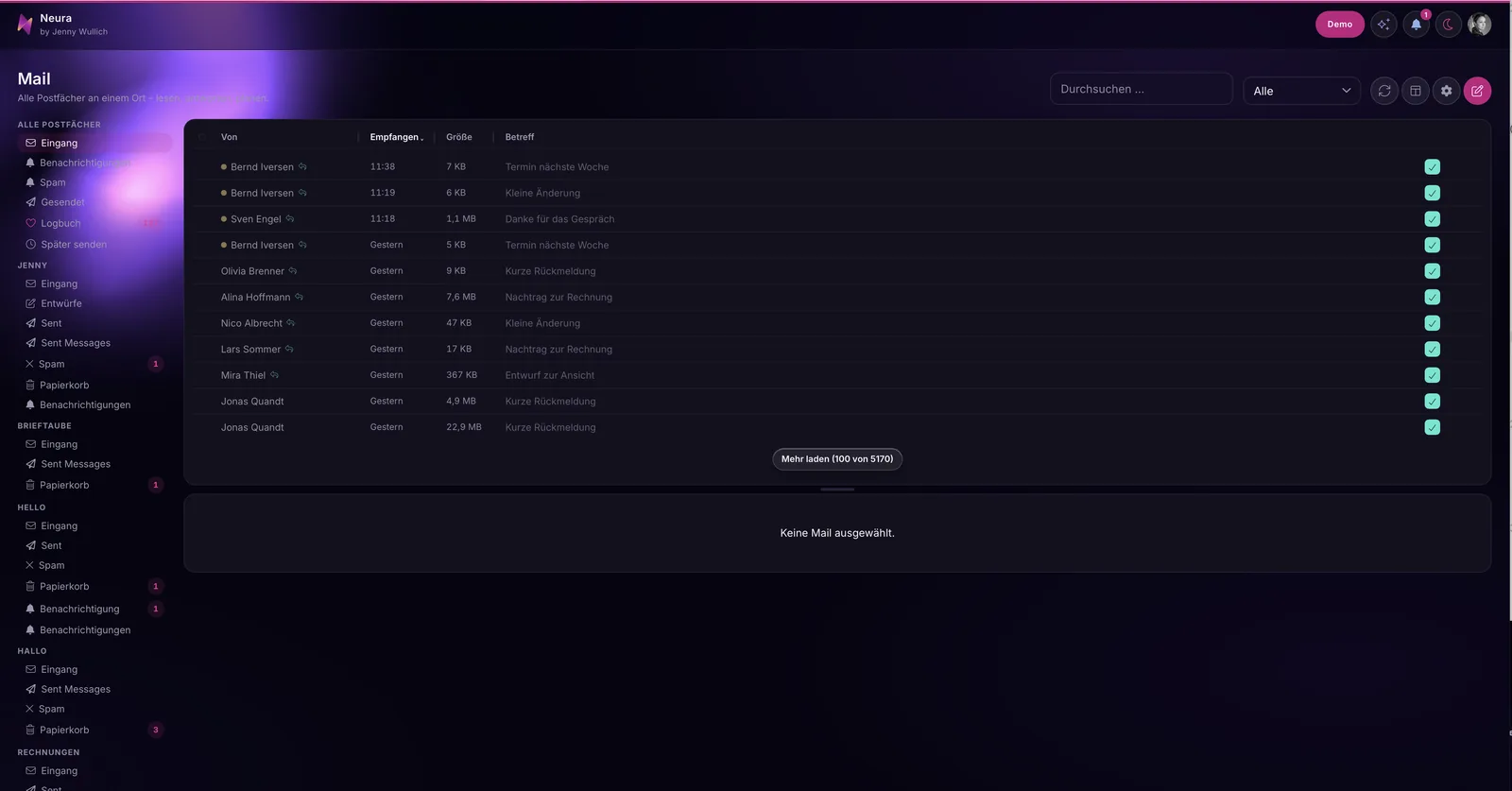
Mail-Bereich: links alle Postfächer untereinander, in der Mitte die Nachrichtenliste, rechts die Lesefläche. Absender, Betreffzeilen und Zahlen sind Platzhalter.
Alle Postfächer an einem Ort, damit die Software merkt, wenn ich einem Kunden noch nicht geantwortet habe.
Every mailbox in one place, so the software notices when I have not answered a client yet.
Omnes cistae epistularum uno loco, ut programma sentiat, cum clienti nondum respondi.

Was Du dafür brauchst, wenn Du es selbst versuchen willst

Du brauchst ein Gestaltungssystem, das schon existiert und in sich stimmig ist. Wenn Du eine Website hast, deren Auftritt Du magst, hast Du es bereits, und dann ist der Weg kurz. Wenn Du keins hast, dann ist das der ehrliche Punkt, an dem die Arbeit vorher beginnt, denn ohne Fundament wiederholt die KI einfach ihren Durchschnitt in einer anderen Farbe.

Du brauchst außerdem konkrete Werte statt Adjektive. Ein Modell kann mit „modern und hochwertig“ nichts anfangen, weil es tausend widersprüchliche Beispiele dafür kennt. Mit einer festgelegten Schrift, einer festgelegten Farbpalette, definierten Abstufungen und einer Regel, welche Schriftgröße wofür gilt, kann es sofort etwas anfangen.

Und denk dabei an die Barrierefreiheit

Sie ist keine Zusatzaufgabe für später, sondern gehört in dieselbe Werteliste wie Farbe und Schrift. Ein Sprachmodell baut sie nicht von allein ein, und es fragt auch nicht danach. Nachträglich einzubauen ist sie deutlich teurer als von Anfang an mitzudenken. Ein paar Werte, mit denen Du sicher liegst:

  • Fließtext nicht unter 16 px, angenehmer sind 17 bis 18 px. Zeilenhöhe rund das Anderthalbfache der Schriftgröße, Zeilenlänge 60 bis 75 Zeichen.
  • Die kleinste Schrift, etwa für Bildunterschriften oder Labels, nicht unter 12 bis 13 px, und dann erst recht mit vollem Kontrast.
  • Kontrast: Fließtext mindestens 4,5:1 zum Hintergrund, große Schrift ab etwa 24 px (oder 19 px fett) mindestens 3:1. Für Bedienelemente, Ränder und Zustände gelten ebenfalls 3:1.
  • Klickflächen mindestens 24 × 24 px, auf dem Handy lieber 44 × 44 px, mit etwas Abstand dazwischen.
  • Ein sichtbarer Fokusrahmen für alle, die mit der Tastatur arbeiten: mindestens 2 px, deutlich abgesetzt, niemals einfach abgeschaltet.
  • Farbe nie allein als Träger einer Bedeutung. Der Ampelpunkt braucht ein Wort daneben, sonst ist er für farbenblinde Menschen stumm.
  • Bewegung nur, wenn sie erwünscht ist: prefers-reduced-motion abfragen und Animationen dann weglassen.

Bei den Schriften kannst Du bei Google Fonts bleiben, es kommt nur darauf an, welche. Gut lesbar sind Schriften mit offenen Formen und unterscheidbaren Buchstaben: Atkinson Hyperlegible wurde eigens für Menschen mit wenig Sehkraft entworfen und unterscheidet I, l und 1 sowie O und 0 sehr deutlich. Inter hat eine große x-Höhe und ist auf dem Bildschirm hervorragend zu lesen. Source Sans 3 ist ruhig und trägt auch längere Texte. IBM Plex Sans bleibt selbst in zahlenlastigen Oberflächen klar. Lexend wurde auf Lesegeschwindigkeit hin gezeichnet. Für Zahlenkolonnen lohnen sich IBM Plex Mono oder JetBrains Mono, oder Du stellst bei Deiner Schrift tabular-nums ein, damit die Ziffern gleich breit stehen und Beträge sauber untereinander laufen.

Eine Bitte noch: Lade diese Schriften selbst gehostet aus Deinem eigenen Projekt, nicht direkt von Googles Servern. Sonst wandert bei jedem Seitenaufruf die IP-Adresse Deiner Nutzerinnen und Nutzer mit, und das willst Du weder ihnen noch Dir zumuten.

Und Du brauchst die Bereitschaft, jedes Ergebnis anzusehen. Ich folge der KI nicht blind. Ich steuere sie, nicht sie mich. Das ist die einzige Stelle, an der ich in solchen Projekten wirklich streng bin, und es ist gleichzeitig der Grund, warum am Ende etwas herauskommt, das nach dem Absender aussieht und nicht nach dem Werkzeug.
Wofür die Oberfläche eigentlich da ist

Es gibt einen Gedanken, der bei Neura jede Entscheidung bestimmt hat: Software soll den Zusammenhang aufbewahren, nicht der Kopf.

Zwischen einem Anruf, einer Mail und der nächsten Aufgabe geht mir manchmal die Information verloren, wo ich eigentlich stehengeblieben war. Die meisten Werkzeuge lassen einen damit allein und erwarten, dass man sich den Zusammenhang selbst merkt.

Deshalb liegen in Neura alle Postfächer an einem Ort, nicht aus Ordnungsliebe, sondern damit die Software selbst merkt, wenn eine Kundenantwort liegengeblieben ist, und mich daran erinnert, bevor es unangenehm wird. Deshalb gibt es eine Stelle, die beim Öffnen zeigt, woran zuletzt gearbeitet wurde, und einen roten Faden, der zu jedem Kunden die Vorgeschichte bereithält. Deshalb liegen Notizen dort, wo sie gebraucht werden, statt in einem separaten Programm. Und deshalb zeigt jeder Bereich immer nur so viel, wie in diesem Moment nötig ist, mit einer klaren Rangfolge statt einer Wand aus gleich lauten Elementen.

Das ist die eigentliche Aufgabe von Gestaltung bei Software, die viel kann: Überflutung vermeiden und den Wiedereinstieg möglich machen. Eine KI baut das nicht von allein, weil sie nicht weiß, wie ein Arbeitstag verläuft. Ich baue Werkzeuge, die mitdenken, weil ich nicht möchte, dass Konzentration die Voraussetzung für gute Arbeit ist.

What you need if you want to try it yourself

You need a design system that already exists and holds together. If you have a website whose look you like, you already have one, and then the path is short. If you do not have one, that is the honest point where the work starts earlier, because without a foundation the AI simply repeats its average in a different colour.

You also need concrete values instead of adjectives. A model can do nothing with „modern and high quality“, because it knows a thousand contradictory examples of it. With a defined typeface, a defined colour palette, defined steps and a rule for which type size applies where, it can get to work immediately.

And think about accessibility while you are at it

It is not an extra task for later, it belongs in the same list of values as colour and type. A language model does not build it in on its own, and it will not ask about it either. Retrofitting it is considerably more expensive than thinking about it from the start. A few values that keep you on safe ground:

  • Body text not below 16 px, 17 to 18 px reads more comfortably. Line height around one and a half times the type size, line length 60 to 75 characters.
  • The smallest type, for captions or labels, not below 12 to 13 px, and at that size all the more with full contrast.
  • Contrast: body text at least 4.5:1 against the background, large type from about 24 px (or 19 px bold) at least 3:1. Controls, borders and states also need 3:1.
  • Click areas at least 24 × 24 px, on a phone rather 44 × 44 px, with a little space between them.
  • A visible focus ring for everyone working with a keyboard: at least 2 px, clearly set off, never simply switched off.
  • Never colour alone as the carrier of a meaning. The traffic-light dot needs a word beside it, otherwise it stays mute for colour-blind people.
  • Motion only where it is wanted: check prefers-reduced-motion and drop the animations when it is set.

For the typefaces you can happily stay with Google Fonts, it only matters which ones. Faces with open shapes and distinguishable letters read well: Atkinson Hyperlegible was designed specifically for people with low vision and separates I, l and 1 as well as O and 0 very clearly. Inter has a large x-height and is excellent on screen. Source Sans 3 is calm and carries longer texts. IBM Plex Sans stays clear even in number-heavy interfaces. Lexend was drawn with reading speed in mind. For columns of numbers, IBM Plex Mono or JetBrains Mono are worth it, or you switch your typeface to tabular-nums so the digits share a width and amounts line up cleanly.

One request: load those fonts self-hosted from your own project, not straight from Google's servers. Otherwise your users' IP addresses travel along with every page view, and that is something you want to spare both them and yourself.

And you need the willingness to look at every result. I do not follow the AI blindly. I steer it, not the other way around. That is the one place where I am genuinely strict in projects like this, and at the same time it is the reason why something comes out at the end that looks like its sender and not like the tool.

What the interface is actually there for

There is one thought that governed every decision in Neura: the software should keep the context, not your head.

Between a phone call, an email and the next task, I sometimes lose the thread of where I had actually stopped. Most tools leave you alone with that and expect you to remember the context yourself.

That is why every mailbox in Neura sits in one place, not out of tidiness, but so the software itself notices when a reply to a client has been left lying around, and reminds me before it gets uncomfortable. That is why there is a place that shows, on opening, what was last worked on, and a red thread that keeps the history ready for every client. That is why notes sit where they are needed instead of in a separate program. And that is why every area only ever shows as much as is necessary in that moment, with a clear hierarchy instead of a wall of equally loud elements.

That is the real task of design in software that can do a lot: avoid flooding and make it possible to get back in. An AI does not build that on its own, because it does not know how a working day unfolds. I build tools that think along, because I do not want concentration to be the precondition for good work.

Quibus rebus egeas, si ipse experiri velis

Eges systemate formandi quod iam exstat et in se consentit. Si paginam habes cuius species tibi placet, id iam habes, et tum via brevis est. Si nullum habes, hic est ille punctus sincerus ubi opus prius incipit, quia sine fundamento intellegentia artificialis medium suum simpliciter alio colore repetit.

Eges praeterea valoribus certis, non adiectivis. Exemplar ex „modernum et pretiosum“ nihil facere potest, quia mille exempla inter se repugnantia eius novit. Litteris statutis, colorum copia statuta, gradibus definitis et regula quae magnitudo litterarum cui rei serviat, statim aliquid agere potest.

Et interea de aditu libero cogita

Non est munus additum in posterum, sed in eundem indicem valorum pertinet quo color et litterae. Exemplar linguae eum sua sponte non inserit neque de eo rogat. Postea inserere multo carius est quam ab initio secum ferre. Ecce pauci valores quibus tuto niteris:

  • Textus currens non infra 16 px; commodius 17 vel 18 px. Altitudo versus fere sesquiplex magnitudinis litterarum, longitudo versus 60 ad 75 litterarum.
  • Litterae minimae, velut in subscriptionibus imaginum aut titulis, non infra 12 vel 13 px, et tum eo magis pleno contrario.
  • Contrarium: textus currens saltem 4,5:1 ad fundum, litterae magnae a fere 24 px (aut 19 px pingues) saltem 3:1. Instrumenta, margines et status item 3:1 poscunt.
  • Areae pulsandi saltem 24 × 24 px, in telephono potius 44 × 44 px, cum aliquo intervallo.
  • Orbis indicii conspicuus omnibus qui claviatura utuntur: saltem 2 px, clare distinctus, numquam simpliciter exstinctus.
  • Numquam color solus sensum ferat. Punctum tricoloris verbum iuxta se poscit, aliter iis qui colores non discernunt mutum manet.
  • Motus tantum ubi optatur: prefers-reduced-motion interroga et tum animationes omitte.

Quod ad litteras attinet, apud Google Fonts manere licet; tantum refert quas eligas. Bene leguntur litterae formis apertis et inter se distinctis: Atkinson Hyperlegible proprie hominibus parum videntibus destinata est et I, l atque 1 nec non O et 0 clarissime distinguit. Inter altitudinem litterae x magnam habet et in quadro optime legitur. Source Sans 3 quieta est et longiores quoque textus fert. IBM Plex Sans etiam in superficiebus numeris gravibus clara manet. Lexend ad celeritatem legendi descripta est. Ad columnas numerorum IBM Plex Mono aut JetBrains Mono prosunt, aut in litteris tuis tabular-nums statuis, ut cifrae eandem latitudinem teneant et summae pure sub se currant.

Unum peto: has litteras ex opere tuo ipso arcesse, non recta ex servitoribus Google. Aliter inscriptio IP usorum tuorum in omni aspectu una migrat, quod neque illis neque tibi imponendum est.

Et eges animo omnem exitum inspiciendi. Intellegentiam artificialem caeca non sequor. Ego eam rego, non illa me. Hic unus est locus ubi in talibus operibus vere severa sum, et idem est causa cur in fine aliquid oriatur, quod auctorem suum referat, non instrumentum.

Cui rei superficies re vera serviat

Est cogitatio quaedam quae apud Neura omne consilium rexit: programma nexum servare debet, non caput tuum.

Inter vocationem, epistulam et proximum munus interdum mihi perit notitia, ubi re vera substiterim. Pleraque instrumenta te cum ea re solum relinquunt et exspectant ut nexum ipse memineris.

Ideo in Neura omnes cistae epistularum uno loco iacent, non ex amore ordinis, sed ut programma ipsum sentiat, cum responsum clienti relictum sit, meque admoneat, priusquam res molesta fiat. Ideo locus est qui, cum aperis, ostendit quid novissime actum sit, et filum rubrum quod ad quemque clientem res gestas praesto habet. Ideo adnotationes ibi iacent ubi opus est, non in alio programmate. Et ideo quaeque pars tantum ostendit quantum hoc momento necesse est, ordine claro, non muro elementorum aeque clamantium.

Hoc est verum munus formae in programmate quod multa potest: inundationem vitare et reditum facilem reddere. Intellegentia artificialis id per se non aedificat, quia nescit quomodo dies laboris procedat. Instrumenta aedifico quae una cogitant, quia nolo intentionem animi condicionem boni operis esse.

Seitliches KI-Panel mit Funken-Symbol und Eingabezeile für gesprochene oder getippte Anweisungen, dahinter unscharf die Kundenübersicht. Alle Namen und Zahlen sind Platzhalter.
Wiederkehrende Bedeutungen bekommen ein festes Zeichen, hier der Funken für alles KI-gestützte.
Recurring meanings get a fixed sign, here the spark for everything AI-supported.
Sensus recurrentes signum certum accipiunt, hic scintilla ad omnia quae ope intellegentiae artificialis fiunt.

Die Übergabe: damit es hält, wenn Du weiterbaust

Der schwierigste Teil kommt nach dem Design. Denn Du baust weiter, mit Deinem Entwickler oder mit derselben KI, die vorher den Durchschnitt gebaut hat. Und beim nächsten Feature steht wieder die Frage im Raum, welche Farbe der Knopf bekommt. Wenn die Antwort darauf nur in meinem Kopf liegt, war die ganze Arbeit eine Momentaufnahme.

Deshalb übergebe ich keine Bilder, sondern Regeln, die im Code stehen und die ein Sprachmodell lesen kann.

Alle Werte an einer Stelle. Farben, Schriftgrößen, Abstände, Rundungen und Schatten liegen als benannte Variablen zentral, nicht verteilt über hundert Dateien. Das kräftige Magenta heißt dann nicht mehr „#e2358f irgendwo im Code“, sondern trägt einen Namen wie Aktion, und wer es ändern will, ändert es einmal. Das ist zugleich der beste Schutz gegen den Rückfall in den Durchschnitt: Es gibt schlicht keine zweite Stelle, an der heimlich eine neue Farbe entstehen könnte.

Bausteine mit Namen und Zweck. Nicht nur „Button“, sondern der eine hervorgehobene Knopf, die leise Nebenaktion, die Karte, die Tabellenzeile, der leere Zustand. Zu jedem gehört ein Satz, wann er benutzt wird. Ein Modell trifft erstaunlich gute Entscheidungen, sobald es weiß, dass es auswählen darf, statt erfinden zu müssen.

Eine Regeldatei, die die KI mitliest. Das ist der Teil, den die meisten übersehen. Die Vorgaben gehören als Text ins Projekt, genau dorthin, wo das Werkzeug bei jeder Anfrage hineinschaut. In ganzen Sätzen steht dort, was gilt: eine hervorgehobene Aktion pro Bildschirm, keine neuen Farben, Zahl groß und Bezeichnung klein, Farbe nur dann, wenn sie etwas bedeutet. Ein Sprachmodell vergisst zwischen zwei Sitzungen alles. Die Datei vergisst nichts.

Zustände, nicht nur Ansichten. Zu jedem Baustein gehört, wie er aussieht, wenn nichts da ist, wenn geladen wird, wenn etwas schiefgeht und wenn der Text länger wird als gedacht. Genau an diesen Stellen sickert später wieder das Generische ein, weil sie im ersten Wurf niemand gebaut hat.

Eine kurze Abnahmeliste. Fünf Fragen, die nach jedem neuen Feature durchgegangen werden: Gibt es genau eine hervorgehobene Aktion? Sind ausschließlich festgelegte Farben im Spiel? Steht der Wert größer als seine Bezeichnung? Trägt jede Farbe eine Bedeutung? Sind leerer Zustand, Ladezustand und Fehlerfall gebaut? Das dauert zwei Minuten und verhindert die schleichende Rückkehr zum Mittelwert.

Und einmal gemeinsam durchgehen. Ich übergebe nicht per Zip-Datei. Wir gehen die Oberfläche zusammen durch, und ich sage zu jeder Entscheidung, warum sie so gefallen ist. Wer den Grund kennt, trifft die nächste Entscheidung selbst richtig, auch wenn ich längst nicht mehr im Projekt bin.

Für Kunden: Was ich in solchen Projekten übernehme

Wenn Du eine Anwendung selbst gebaut hast und sie soll nach Deinem Unternehmen aussehen statt nach einer Vorlage, dann übernehme ich genau diesen Weg. Ich lege Dein bestehendes Corporate Design als Fundament unter die Software, sorge dafür, dass Schrift, Farbe, Icons, Bildsprache und Wording durchgehend gelten, bringe eine Rangfolge in die Oberfläche, und kümmere mich um die Zustände, die im ersten Wurf fehlen.

Du bekommst dabei kein Bilderpaket, das jemand nachbauen muss, sondern eine Vorgabe, die im Code landet, also festgelegte Werte, benannte Bausteine und eine Übergabe, mit der Dein Entwickler oder Dein KI-Werkzeug weiterarbeiten kann, ohne dass beim nächsten Feature alles wieder auseinanderfällt.

Was ich nicht mache, ist blind das umsetzen, was ein Modell vorschlägt. Ich schaue mir jeden Schritt an, korrigiere und sage Dir auch, wenn mir etwas nicht gefällt. Das ist keine Strenge um ihrer selbst willen, sondern der Grund, warum am Ende etwas dasteht, hinter dem wir beide stehen können. Wenn Du jemanden suchst, der schnell durchwinkt, passen wir vermutlich nicht zusammen, und auch das darf man freundlich feststellen.

Häufige Fragen

Kann ich mein Corporate Design überhaupt in eine selbst gebaute Software übertragen?

Ja, und das ist der schnellste Weg zu einem eigenständigen Ergebnis. Am besten geht es in dieser Reihenfolge: Sammle zuerst die harten Werte Deines Auftritts an einer Stelle, also die Schriften mit ihren Größen, die Farbwerte samt ihrer Bedeutung, Abstände, Rundungen und den Ton, in dem Du sprichst. Kein Stimmungsbild, sondern eine Liste, die man abschreiben kann. Wenn Du eine Website hast, deren Auftritt Du magst, steht diese Liste im Grunde schon in deren Stylesheet.

Diese Liste legst Du als Datei ins Projekt, dorthin, wo Dein KI-Werkzeug bei jeder Anfrage hineinschaut, und gibst einen einzigen klaren Auftrag: dieses System auf die bestehende Oberfläche übertragen, ohne neue Farben oder Schriften zu erfinden. Danach gehst Du Bildschirm für Bildschirm durch und korrigierst, was nur das Auge sieht. Genau das ist das Fundamentprinzip weiter oben, in drei Sätzen.

Muss der Code dafür umgebaut werden?

In der Regel nicht grundlegend. An der Logik ändert sich nichts, es wandern nur die Einzelwerte aus den Bauteilen an eine gemeinsame Stelle.

Wo diese Stelle liegt, hängt davon ab, womit gebaut wurde. In reinem CSS sind es benannte Variablen ganz oben im Stylesheet, im :root-Block, auf den alles andere zugreift. Bei Tailwind steht dasselbe in der Theme-Konfiguration. In React oder Vue reicht eine einzelne Theme-Datei, die die Werte exportiert. Wichtig ist nur, dass es genau eine solche Stelle gibt und nicht drei. Dazu kommt die Regeldatei für die KI, in der in Worten steht, wann welcher Wert gilt, damit beim nächsten Feature niemand wieder eine eigene Farbe erfindet.

Wie lange dauert so ein Projekt?

Der große Sprung passiert früh und schnell, die Feinarbeit braucht die Zeit. Bei meinem eigenen Werkzeug waren es drei bis vier Wochen mit mehreren Abstimmungsrunden.

Brauche ich dafür Figma?

Nicht zwingend. Entscheidend ist nicht das Werkzeug, sondern dass die Vorgaben als konkrete Werte vorliegen und im Code ankommen. Bei Neura ist das Design komplett im Kopf entstanden und direkt im Code gelandet, ich arbeite inzwischen ganz ohne Figma. Wenn ein Team mitschauen und Zwischenstände abnehmen will, kann ein Entwurf trotzdem sinnvoll sein. Für Dich allein ist er meistens ein Umweg.

Was, wenn ich noch kein Corporate Design habe?

Das kommt auf Dein Ziel an. Läuft die Software vor allem für Dich selbst, darf das Corporate Design auch beim Bauen entstehen. Du triffst dabei ohnehin lauter kleine Entscheidungen über Farbe, Schrift und Ton; wenn Du sie einmal sortierst und festhältst, hast Du am Ende ein System, das auch für Website und Drucksachen trägt. Bei mir war es andersherum, die Website stand zuerst, und deshalb war der Weg kurz.

Wirkt die Software dagegen nach außen, gegenüber Kunden oder Investoren, würde ich mit der Marke anfangen. Sonst entscheidet die Software darüber, wie Dein Unternehmen aussieht, statt umgekehrt.

Lohnt sich das für ein MVP?

MVP steht für Minimum Viable Product, also die erste lauffähige Fassung, die gerade genug kann, um sie echten Menschen zu zeigen. Und ja, gerade dort lohnt es sich: Ein MVP ist oft der erste Eindruck bei Kunden oder Investoren, und ein austauschbares Aussehen wird genau in diesem Moment teuer.

Was passiert, wenn ich nach der Übergabe selbst weiterbaue?

Genau dafür ist die Übergabe gemacht. Praktisch bekommst Du drei Dinge: eine Datei mit allen Werten, die angepassten Bausteine und eine Regeldatei, die in ganzen Sätzen erklärt, was gilt.

Liegt Dein Projekt in Git, kommt das als eigener Branch oder als Pull Request, den Du in Ruhe ansiehst und dann zusammenführst. Nichts wird hinter Deinem Rücken überschrieben, und Du kannst jederzeit zurück. Ohne Git bekommst Du dieselben Dateien als Paket, mit einer kurzen Notiz, welche wohin gehört.

Das Einrichten dauert Minuten, nicht Stunden. Die Wertedatei wird einmal zentral eingebunden, an derselben Stelle, an der auch Dein übriges CSS geladen wird. Die Regeldatei legst Du unverändert ins Projektverzeichnis, genau dorthin, wo Dein KI-Werkzeug von selbst hineinschaut, bei Claude Code etwa als Projektdatei im Wurzelverzeichnis. Arbeitest Du mit einem Baukasten wie Lovable, kommen die Regeln stattdessen in die Projektanweisungen und die Werte in die Theme-Einstellungen.

Und dann gehen wir es einmal zusammen durch, meist reicht eine halbe Stunde: ziehen, anschauen, zusammenführen. Dabei zeige ich Dir an einem echten Beispiel, wie Du das nächste Feature formulierst, damit es sich an die Regeln hält. Danach brauchst Du mich dafür nicht mehr.

Und falls Du gerade auf eine Oberfläche schaust, die funktioniert, aber nicht nach Dir aussieht: Das ist kein Grund, an Dir zu zweifeln. Das ist ein völlig normaler Zwischenstand, und Du bist damit gerade in ziemlich guter Gesellschaft. Schreib mir einfach, ich schaue es mir in Ruhe an und sage Dir ehrlich, ob Dein bestehender Auftritt als Fundament ausreicht und was der kürzeste Weg dorthin wäre. Auch dann, wenn die Antwort lautet, dass Du das gut allein hinbekommst.

The handover: so it holds when you keep building

The hardest part comes after the design. Because you carry on building, with your developer or with the same AI that built the average before. And with the next feature the question is back on the table: what colour does this button get? If the answer to that lives only in my head, the whole job was a snapshot.

That is why I do not hand over images but rules that live in the code and that a language model can read.

Every value in one place. Colours, type sizes, spacing, corner radii and shadows sit centrally as named variables, not spread across a hundred files. The strong magenta is no longer „#e2358f somewhere in the code“, it carries a name like action, and whoever wants to change it changes it once. That is at the same time the best protection against falling back into the average: there simply is no second place where a new colour could quietly appear.

Building blocks with names and a purpose. Not just „button“, but the one highlighted button, the quiet secondary action, the card, the table row, the empty state. Each with one sentence on when it is used. A model makes astonishingly good decisions as soon as it knows it may choose rather than having to invent.

A rules file the AI reads along. This is the part most people overlook. The specification belongs in the project as text, exactly where the tool looks on every request. It states in full sentences what applies: one highlighted action per screen, no new colours, number large and label small, colour only when it means something. A language model forgets everything between two sessions. The file forgets nothing.

States, not just views. Every building block includes how it looks when there is nothing, when something is loading, when something goes wrong and when the text runs longer than expected. Those are precisely the places where the generic seeps back in later, because nobody built them in the first draft.

A short acceptance list. Five questions to run through after every new feature: is there exactly one highlighted action? Are only defined colours in play? Is the value set larger than its label? Does every colour carry a meaning? Are the empty state, the loading state and the error case built? It takes two minutes and prevents the slow drift back to the mean.

And one walk-through together. I do not hand over by zip file. We go through the interface together and I say, for every decision, why it was made that way. Whoever knows the reason makes the next decision correctly on their own, long after I have left the project.

For clients: what I take on in projects like this

If you have built an application yourself and it should look like your company rather than like a template, then I take on exactly this path. I lay your existing corporate design underneath the software as a foundation, make sure that typeface, colour, icons, imagery and wording apply throughout, bring a hierarchy into the interface, and take care of the states that are missing in the first draft.

What you get is not a package of images that somebody has to rebuild, but a specification that lands in the code: defined values, named building blocks and a handover your developer or your AI tool can carry on with, without everything falling apart again at the next feature.

What I do not do is blindly implement whatever a model suggests. I look at every step, correct, and I will also tell you when something does not sit right with me. That is not strictness for its own sake, it is the reason something ends up standing there that we can both stand behind. If you are looking for someone to wave things through quickly, we are probably not a good match, and that too can be said kindly.

Frequently asked questions

Can I transfer my corporate design into software I built myself?

Yes, and it is the fastest route to a result of your own. It works best in this order: first gather the hard values of your identity in one place, the typefaces with their sizes, the colour values along with their meaning, spacing, corner radii and the tone you speak in. Not a mood board, but a list somebody could copy out. If you have a website whose look you like, that list is essentially already sitting in its stylesheet.

You put that list into the project as a file, right where your AI tool looks on every request, and you give one single clear instruction: transfer this system onto the existing interface without inventing new colours or typefaces. After that you go through it screen by screen and correct what only the eye can see. That is exactly the foundation principle above, in three sentences.

Does the code have to be rebuilt for that?

As a rule, not fundamentally. The logic stays as it is, only the individual values migrate out of the components into one shared place.

Where that place sits depends on what it was built with. In plain CSS it is named variables at the very top of the stylesheet, in the :root block everything else reaches into. With Tailwind the same lives in the theme configuration. In React or Vue a single theme file exporting the values is enough. What matters is only that there is exactly one such place and not three. On top of that comes the rules file for the AI, stating in words when which value applies, so that nobody invents their own colour again at the next feature.

How long does a project like this take?

The big leap happens early and fast, the fine work takes the time. For my own tool it was three to four weeks with several rounds of review.

Do I need Figma for this?

Not necessarily. What matters is not the tool but that the specifications exist as concrete values and arrive in the code. With Neura the design took shape entirely in my head and went straight into the code; by now I work without Figma altogether. If a team wants to look along and sign off on intermediate states, a draft can still make sense. On your own it is usually a detour.

What if I do not have a corporate design yet?

That depends on your goal. If the software mainly runs for you yourself, the corporate design may just as well emerge while building. You are making dozens of small decisions about colour, type and tone anyway; sort them once and write them down, and you end up with a system that also carries a website and print materials. For me it was the other way round, the website came first, which is why the path was short.

If the software faces outwards, towards clients or investors, I would start with the brand. Otherwise the software decides what your company looks like, instead of the other way around.

Is it worth it for an MVP?

MVP stands for minimum viable product: the first running version that does just enough to be shown to real people. And yes, that is exactly where it pays off. An MVP is often the first impression on clients or investors, and an interchangeable look becomes expensive at precisely that moment.

What happens if I keep building myself after the handover?

That is exactly what the handover is made for. In practice you get three things: one file with all the values, the adapted building blocks, and a rules file that explains in full sentences what applies.

If your project lives in Git, it arrives as its own branch or a pull request that you review calmly and then merge. Nothing gets overwritten behind your back, and you can go back at any time. Without Git you get the same files as a package, with a short note on what goes where.

Setting it up takes minutes, not hours. The values file is included once centrally, in the same place your other CSS is loaded. The rules file goes unchanged into the project directory, exactly where your AI tool looks by itself, with Claude Code for instance as a project file in the root. If you work with a builder such as Lovable, the rules go into the project instructions instead and the values into the theme settings.

And then we walk through it together once, half an hour is usually enough: pull, look, merge. While we do, I show you with a real example how to phrase the next feature so that it keeps to the rules. After that you do not need me for it.

And if you are currently looking at an interface that works but does not look like you: that is no reason to doubt yourself. It is a completely normal in-between state, and you are in rather good company right now. Just write to me, I will look at it calmly and tell you honestly whether your existing identity is enough of a foundation and what the shortest path there would be. Including when the answer is that you will manage this perfectly well on your own.

Traditio: ut permaneat, cum ulterius aedificas

Pars difficillima post formam venit. Nam ulterius aedificas, cum programmatore tuo aut cum eadem intellegentia artificiali quae antea medium aedificavit. Et in proximo munere rursus quaeritur, quem colorem pulsabulum accipiat. Si responsum eius in solo capite meo iacet, totum opus imago momenti fuit.

Ideo non imagines trado, sed regulas quae in codice stant et quas exemplar linguae legere potest.

Omnes valores uno loco. Colores, magnitudines litterarum, intervalla, angulorum rotunditates et umbrae ut variabiles nominatae centraliter iacent, non per centum tabellas dispersae. Magenta acre non iam est „#e2358f alicubi in codice“, sed nomen gerit velut actio, et qui mutare vult semel mutat. Idem est praesidium optimum contra relapsum in medium: simpliciter nullus alter locus est ubi novus color clam oriri possit.

Elementa cum nomine et fine. Non tantum „pulsabulum“, sed unum illud eminens, actio secunda quieta, charta, versus tabulae, status vacuus. Ad singula pertinet una sententia, quando adhibeantur. Exemplar mire bona consilia capit, simul atque scit sibi eligere licere neque inveniendum esse.

Tabella regularum quam intellegentia artificialis una legit. Haec pars est quam plerique neglegunt. Praescripta ut textus in opus pertinent, eo ipso loco ubi instrumentum in omni rogatione inspicit. Ibi plenis sententiis stat quid valeat: una actio eminens in quoque quadro, nulli colores novi, numerus magnus et titulus parvus, color tantum ubi aliquid significat. Exemplar linguae inter duas sessiones omnia obliviscitur. Tabella nihil obliviscitur.

Status, non solum species. Ad omne elementum pertinet, qualis sit cum nihil adest, cum arcessitur, cum quid male cedit et cum textus longior fit quam putabatur. His ipsis locis postea vulgare rursus irrepit, quia in prima adumbratione nemo ea aedificavit.

Index brevis probandi. Quinque quaestiones post quodque munus novum percurrendae: estne una tantum actio eminens? Adsuntne soli colores statuti? Starne valor maior quam titulus suus? Fertne quisque color sensum? Suntne status vacuus, status arcessendi et casus erroris aedificati? Id duo momenta poscit et reditum lentum ad medium prohibet.

Et semel una percurrere. Non per fasciculum compressum trado. Superficiem una perlustramus, et de quoque consilio dico cur ita ceciderit. Qui causam novit, proximum consilium ipse recte capit, etiam cum ego iam pridem in opere non sum.

Clientibus: quid in talibus operibus suscipiam

Si applicationem ipse aedificasti et negotium tuum referre debet, non exemplar vulgare, hanc ipsam viam suscipio. Formam societatis tuam ut fundamentum sub programma substruo, curo ut litterae, color, signa, imagines et verba ubique valeant, ordinem in superficiem induco, et status curo qui in prima adumbratione desunt.

Non accipis fasciculum imaginum quem aliquis denuo aedificare debeat, sed praescriptum quod in codicem pervenit: valores statutos, elementa nominata et traditionem qua tuus programmator aut tuum instrumentum artificiale pergere possit, ne in proximo munere omnia rursus dilabantur.

Quod non facio: caeca exsequi quidquid exemplar proponit. Singulos gradus inspicio, corrigo, et tibi quoque dico, cum mihi aliquid non placet. Non est severitas sui causa, sed causa cur in fine aliquid stet, cui uterque nostrum adesse possit. Si quaeris qui celeriter omnia transmittat, fortasse inter nos non convenimus, et id quoque benigne dici licet.

Quaestiones frequentes

Possumne formam societatis meae in programma a me ipso aedificatum transferre?

Ita, et haec via ad exitum proprium celerrima est. Optime hoc ordine procedit: primum valores certos speciei tuae uno loco collige, id est litteras cum magnitudinibus suis, colores cum sensu suo, intervalla, rotunditates et sonum quo loqueris. Non imaginem animi, sed indicem quem quis describere possit. Si paginam habes cuius species tibi placet, hic index fere iam in eius stylorum tabella stat.

Hunc indicem ut tabellam in opus imponis, eo ipso loco ubi instrumentum tuum artificiale in omni rogatione inspicit, et unum mandatum clarum das: hoc systema in superficiem praesentem transferre, nullis coloribus aut litteris novis inventis. Deinde per singula quadra procedis et corrigis quod solus oculus videt. Id ipsum est principium fundamenti supra descriptum, tribus sententiis.

Debetne codex propter hoc refici?

Plerumque non funditus. Ratio ipsa manet; soli valores singuli ex elementis in unum locum communem migrant.

Ubi ille locus sit, ex eo pendet quo instrumento aedificatum est. In mero CSS sunt variabiles nominatae in summa stylorum tabella, in illo :root loco quem cetera omnia adeunt. Apud Tailwind idem in configuratione thematis stat. In React aut Vue una tabella thematis sufficit, quae valores exportat. Id unum refert, ut unus talis locus sit, non tres. Accedit tabella regularum pro intellegentia artificiali, in qua verbis stat quando quis valor valeat, ne quis in proximo munere rursus colorem proprium inveniat.

Quamdiu tale opus durat?

Magnus saltus mature et celeriter fit, opus subtile tempus poscit. In instrumento meo tres vel quattuor hebdomades fuerunt cum pluribus vicibus deliberandi.

Egeone ad hoc Figma?

Non necessario. Non instrumentum refert, sed ut praescripta ut valores certi adsint et in codicem perveniant. Apud Neura forma tota in animo meo nata est et statim in codicem venit; iam prorsus sine Figma laboro. Si grex una spectare et gradus intermedios probare vult, adumbratio tamen prodesse potest. Tibi soli plerumque ambages est.

Quid, si formam societatis nondum habeo?

Id ex fine tuo pendet. Si programma maxime tibi ipsi servit, forma societatis etiam inter aedificandum nasci potest. Aedificans utique multa parva consilia de colore, litteris et sono capis; ea semel dispone et adnota, et in fine systema habes quod etiam paginae et chartis impressis sufficit. Apud me contrarium fuit: pagina prior stabat, ideo via brevis erat.

Sin programma foras spectat, ad clientes aut pecuniae datores, a nota inciperem. Aliter programma decernit qualis negotium tuum videatur, non contra.

Prodestne hoc in primo opere probatorio (MVP)?

MVP significat „minimum viable product“, id est prima forma currens quae tantum praestat, ut hominibus veris ostendi possit. Et ita, ibi maxime prodest: opus probatorium saepe prima species apud clientes aut pecuniae datores est, et aspectus permutabilis hoc ipso momento carus fit.

Quid fit, si post traditionem ipse ulterius aedifico?

Ad hoc ipsum traditio facta est. Re vera tria accipis: tabellam cum omnibus valoribus, elementa accommodata et tabellam regularum quae plenis sententiis explicat quid valeat.

Si opus tuum in Git iacet, id ut ramus proprius aut ut rogatio coniungendi venit, quam otiose inspicis et deinde coniungis. Nihil te nesciente superscribitur, et semper redire potes. Sine Git easdem tabellas ut fasciculum accipis cum brevi adnotatione, quid quo pertineat.

Instituere momenta poscit, non horas. Tabella valorum semel in medio inseritur, eodem loco quo cetera CSS tua arcessitur. Tabellam regularum immutatam in indicem operis ponis, eo ipso loco ubi instrumentum tuum artificiale sua sponte inspicit, apud Claude Code exempli gratia ut tabellam operis in radice. Si arca aedificandi qualis Lovable uteris, regulae in mandata operis, valores in optiones thematis eunt.

Deinde semel una perlustramus, plerumque dimidia hora sufficit: trahere, inspicere, coniungere. Interea vero exemplo tibi ostendo, quomodo proximum munus formules, ut regulas servet. Postea me ad hoc non amplius eges.

Et si nunc in superficiem spectas quae valet, sed te non refert: non est cur de te dubites. Status intermedius prorsus usitatus est, et bona in societate nunc es. Scribe mihi simpliciter; otiose inspiciam et sincere tibi dicam, num species tua praesens ut fundamentum sufficiat et quae via brevissima eo ducat. Etiam tum, cum responsum erit te id solum bene perfecturum esse.

← Zurück zum Logbuch
Jenny Wullich

Schaust du gerade auf etwas, das funktioniert, aber nicht nach dir aussieht?

Dann lass uns in Ruhe gemeinsam draufschauen, ganz unkompliziert in einem Video-Call. Ich sage dir ehrlich, ob dein bestehender Auftritt als Fundament trägt, und wenn ja, was der kürzeste Weg dorthin wäre.